Facade Design
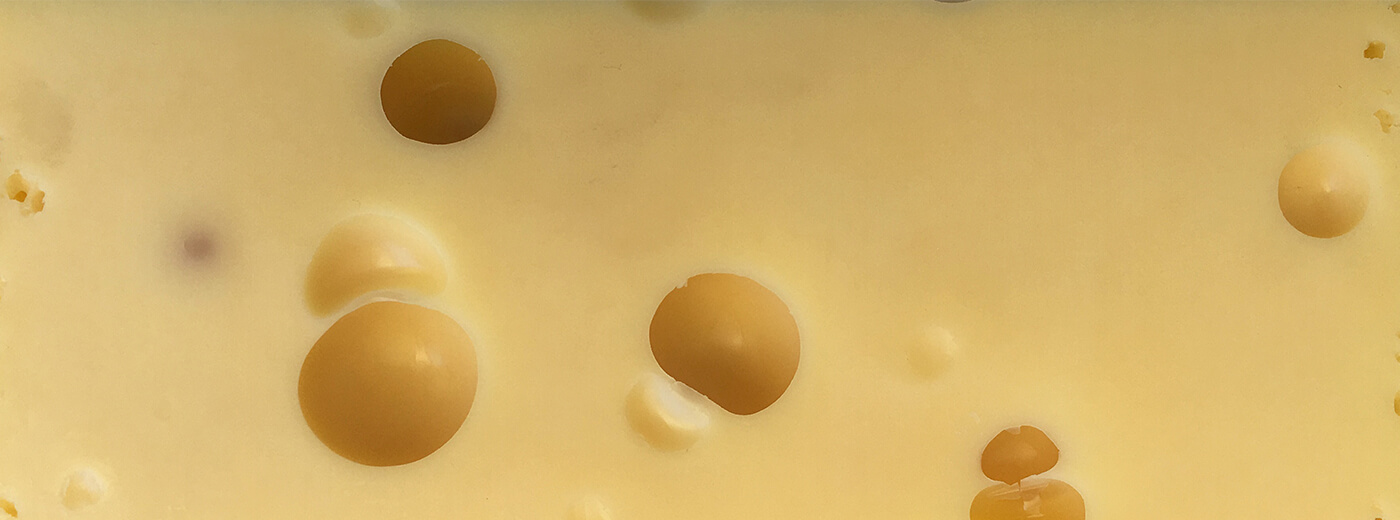
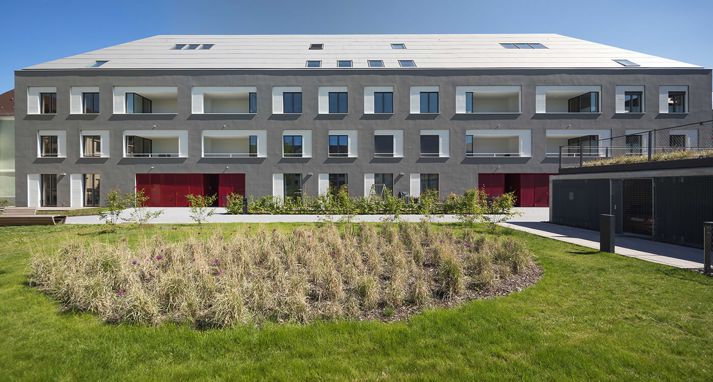
Holes in the cheese are round and irregularly distributed. Holes in the façade are window openings that are rarely round and usually square. The architect speaks of punctuated facades. Typical are evenly arranged window strips, which are repeated on each floor to form a grid.
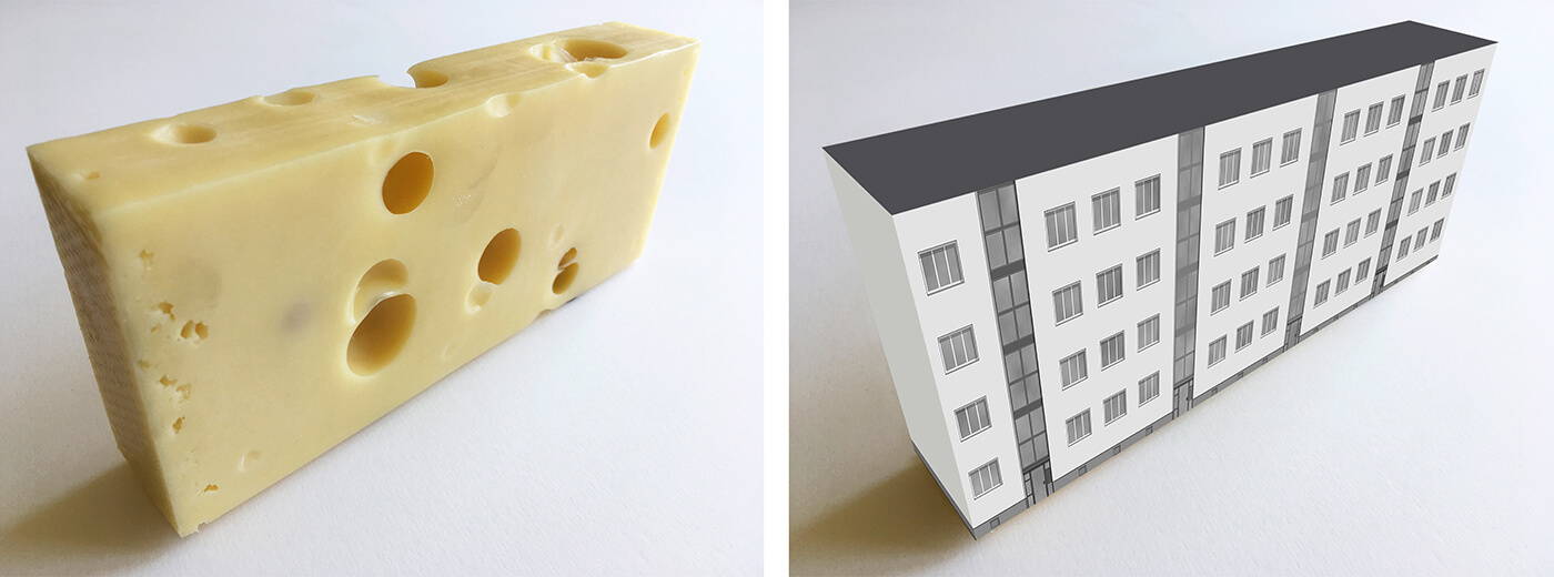
A block of flats with "window holes" differs from a piece of cheese, whose holes are sometimes larger, sometimes smaller and sometimes isolated or appear as a group of holes. This makes the cheese look interesting. The façade, however, often appears monotonous and boring due to its uniformity. Can the cheese serve as an example?
The realisation that irregularity creates suspense can become a design motif. This is in line with the fact that individualisation is a mega-trend. This applies not only to people and products, but also to architecture! And so, more and more often, there is the chance to give even a dull punctuated façade an appearance that stands out from comparable houses.
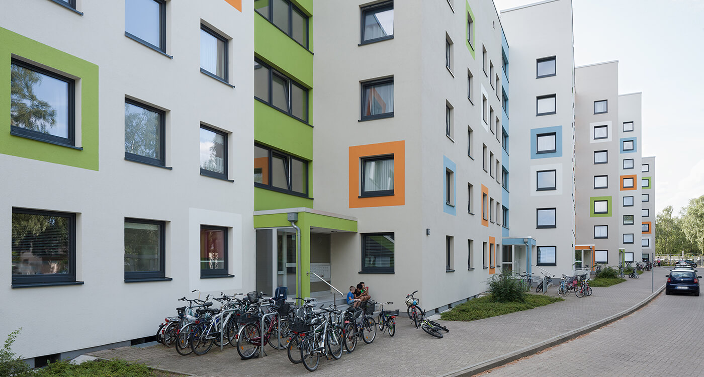
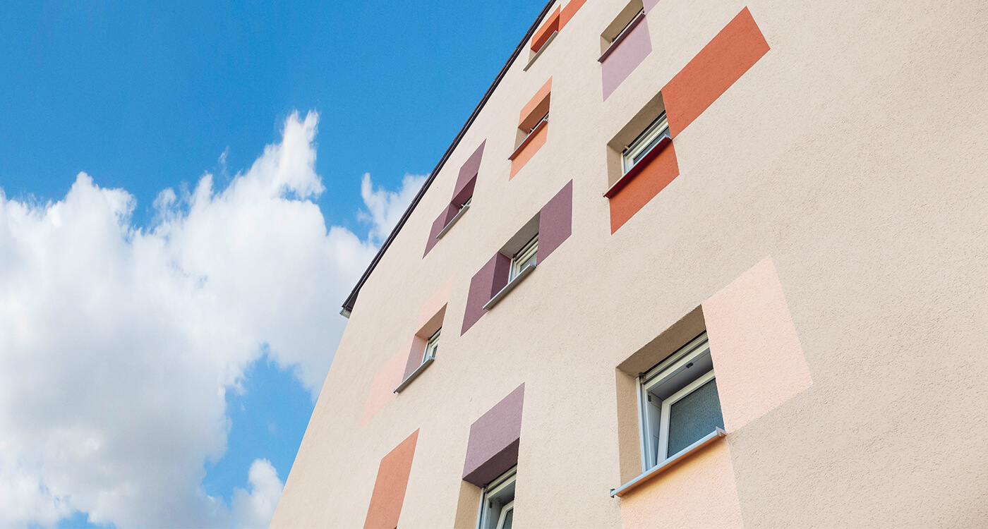
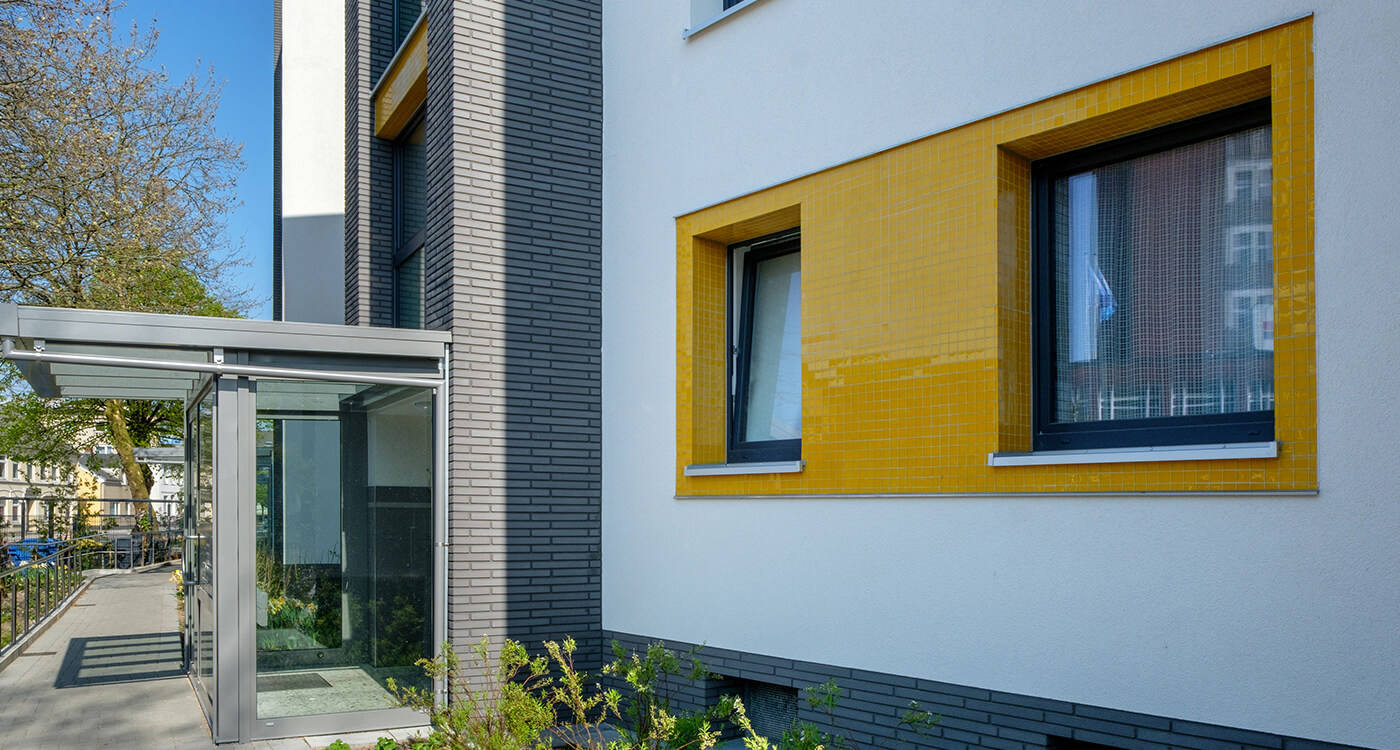
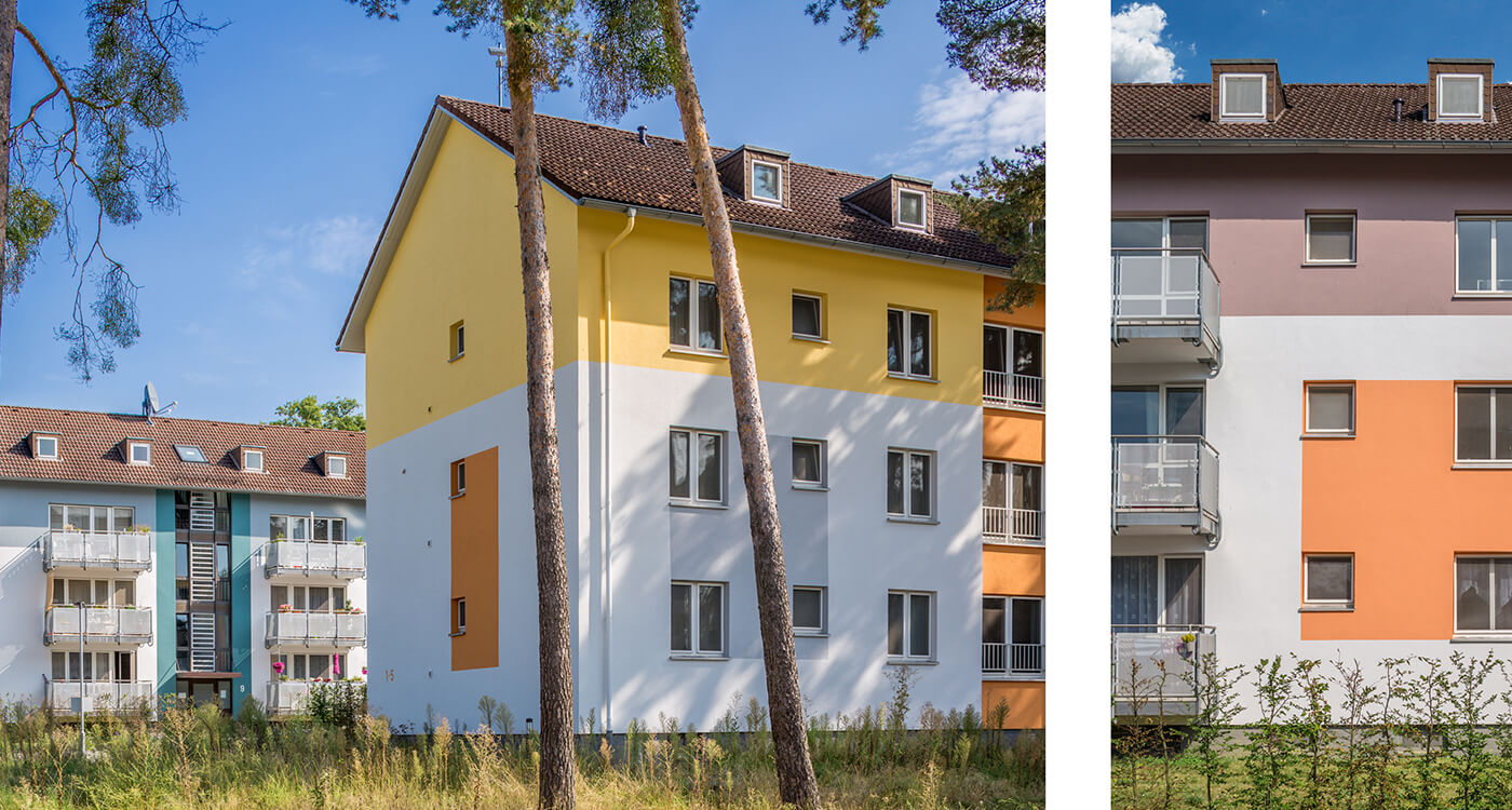
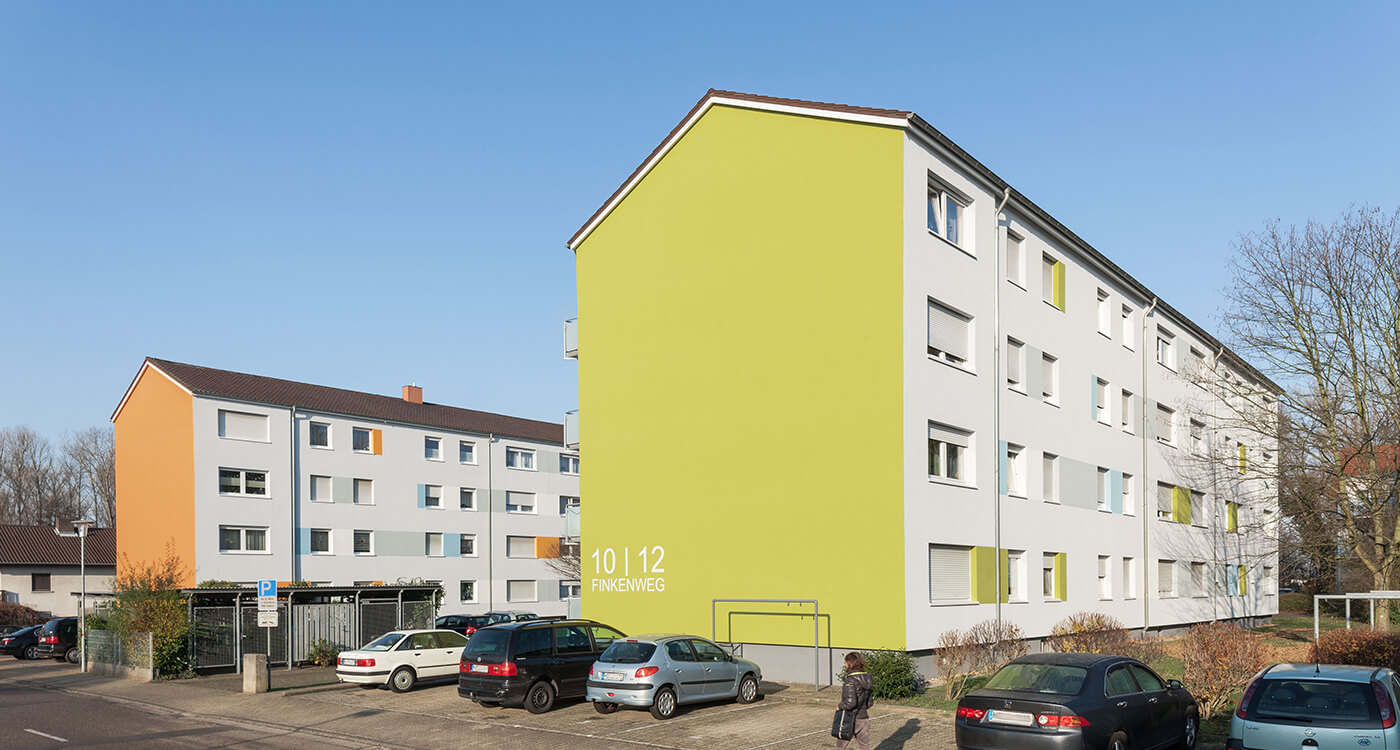
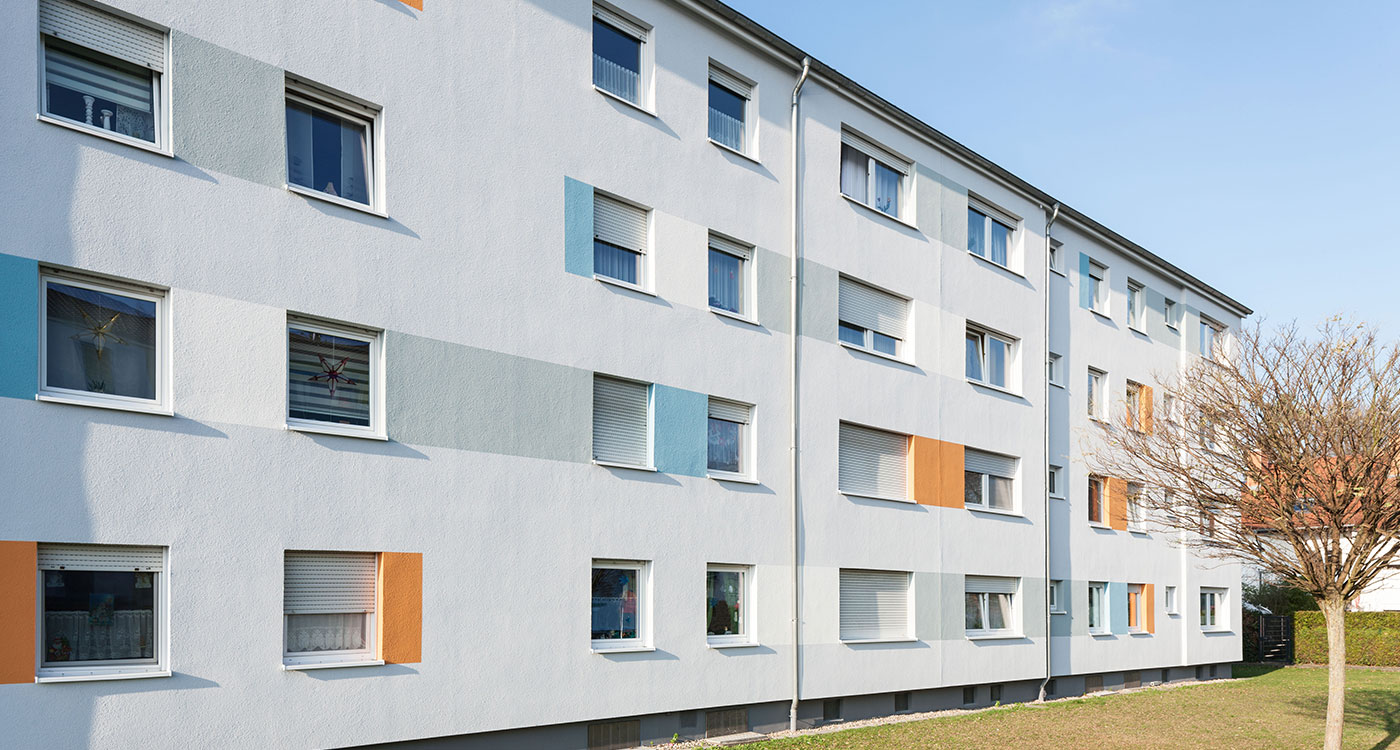
The cheese principle applies: Irregular holes are the model! Individual window openings are framed in colour or emphasised irregularly. This creates interruptions and new areas of suspense between the highlighted elements. This method is simple. So there is no need to hire an artist to enhance the appearance of a facade, to make it look more individual and exciting.
Several windows establish a connection by being joined together to form a band or surface. Thus "the holes" suddenly attain significance and meaning. The result is a self-confident appearance, especially when courageous colours are used.
Resume: More Cheese!
To return to the initial question: Yes, cheese is a good example! In a figurative sense, the piece of cheese stands for an area and the holes for individual points. Point studies can thus be carried out on the cheese. It will become apparent that the distribution of the holes is sometimes more, sometimes less interesting and exciting. This has to do with the relationship of the points to each other and to the surface, as well as with the size of the points respectively holes. These findings can be transferred to the facade. If the window openings can no longer be changed, you can let "dots step out of line" by accentuating individual windows or groups of windows, e.g. by individual coloured window surrounds, asymmetrical edges, horizontal or vertical window bands or surfaces. These changes "disturb" the previous symmetry of the facade surface in a pleasant way and at the same time create the possibility of placing asymmetrical highlights in a balanced relationship through a new structure. In this way, a facade can have very different and very individual characteristics, and all this with relatively simple means that do not require a huge budget.
You can find out more about our references here.


