The Yearning for Blue
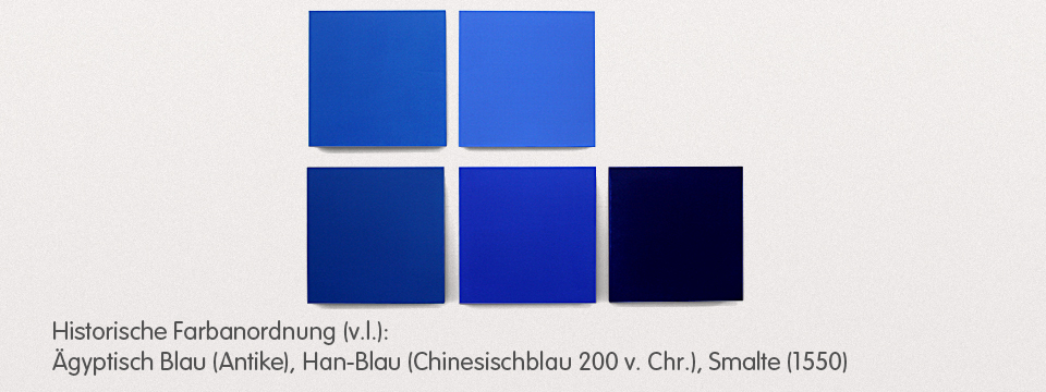
Pure colour pleasure: ultramarine, azurite, indigo, manganese, celin, and cobalt blue
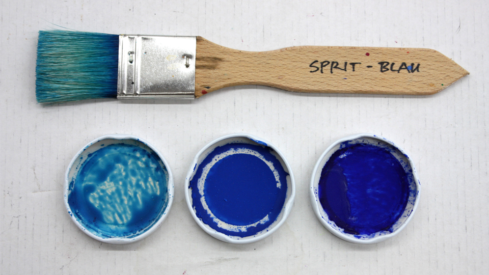
"Blue is in. Just like 10 years ago. Just like 100 years ago. Blue is the Number One colour in the Western World."1
These lines were published over 25 years ago in a reference book on the colour blue and they are still valid today. Currently, shades of blue are back in high demand in 2015. Shades of blue are a trend.
Where does this persistent and even increasing yearning for blue come from?
This question is not new either and has already been answered by well-known authors: "Just as we like to follow a pleasant object that flees from us, we like to look at the blue, not because it urges us but because it drags us along." – says Goethe in his famous Theory of Colours.2
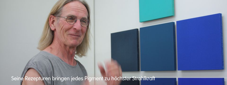
"We humans love blue because it gives us space to actively participate. For me personally, manganese blue with its transparency and infinity is the colour that is most associated with longing," says Stefan Muntwyler and he knows what he is talking about.
Stefan Muntwyler
Stefan Muntwyler is a passionate colour researcher. The people around him in Switzerland would rather call him "The Pigmentist", "the one with the pigments". In the English language he would be the "Colourman".
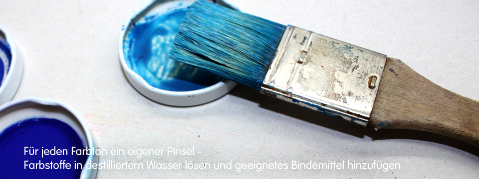
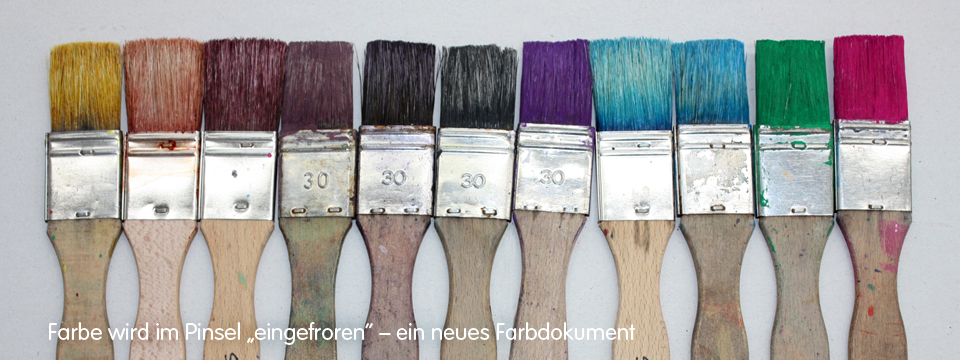
In his colour laboratory, Muntwyler experiments with painting bases, binders, natural and synthetic pigments and develops formulas that make the respective pigment shine in its purest form. He is interested in the monochrome effect of pure, unmixed colours. He paints them accurately on colour panels according to a precisely defined concept.
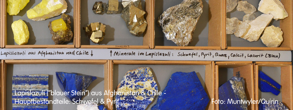
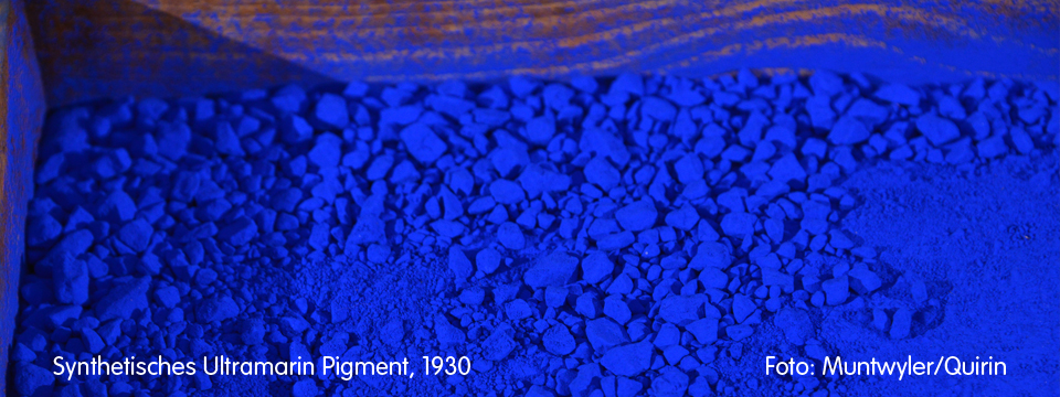
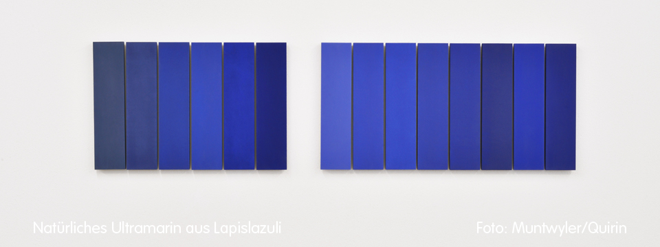
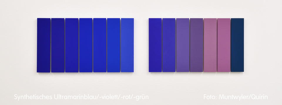
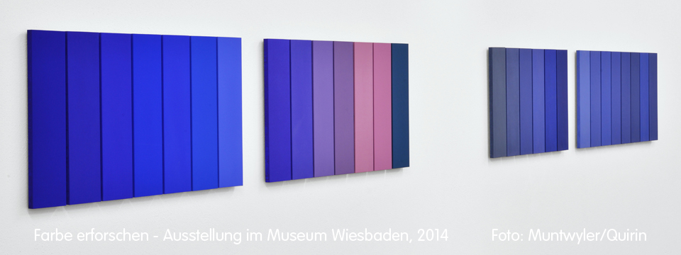
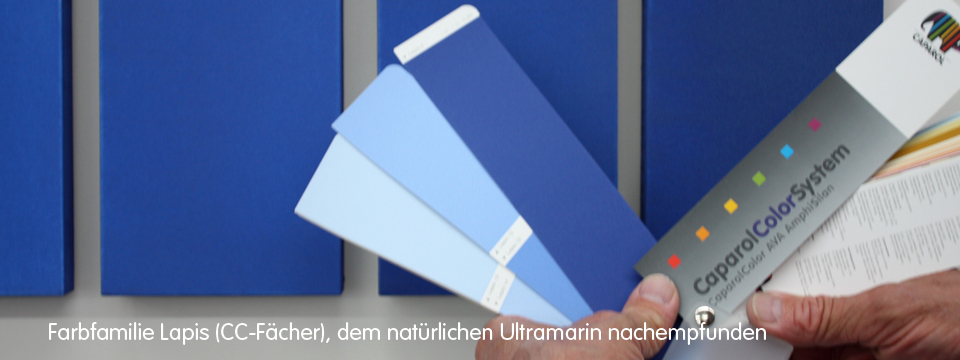
He studied ultramarine blue in particular. Last year, he exhibited works using natural ultramarine from lapis lazuli and various artificial ultramarine pigments at Museum Wiesbaden.
The Colour Workshop
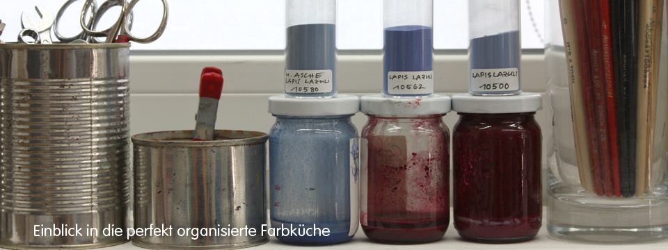
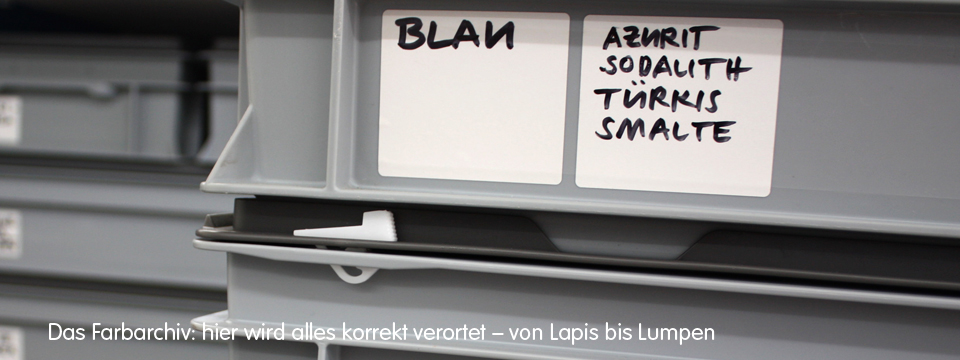
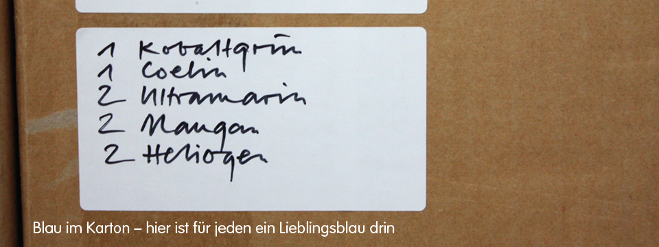
The trained primary school teacher has all the ideal virtues for his special work: concentration, patience and endurance. His colour studio rather resembles a colour archive with an experimental laboratory. Here everything is neatly lined up, labelled and ready at hand - far from any artistic chaos. Despite all the discipline, the colour researcher has developed a keen eye for the accidental. Thus small treasures are created again and again as a by-product of painting colour fields, e.g. colour cloths used to catch drops and then become the object of the viewer.

When carefully painting the colour fields, new colour treasures are created on the substrates.
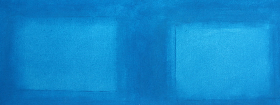
As a by-product, coloured window pictures with fantastic luminosity are created from paper substrates (manganese blue, 70x100cm)
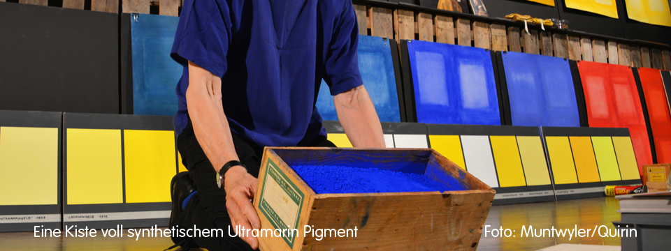
Stefan Muntwyler has collected and archived found objects on the subject of colour from all over the world in an impressively tidy manner. Besides the paint pots, brushes and mortars usually found in a paint workshop, there are cupboards and shelves full of roller containers and boxes with rock and material samples, pigment collections, work equipment, and archived works.
The Pigmentist
Stefan Muntwyler works a lot in his 'colour kitchen' and likes to take his time for his colour business. He paints monochromatically, i.e. only with a pure hue. By making the pure pigment the subject of his painting, he combines science and art. "At the moment, there is no other painter who can depict a colour as intensively," claims his former teacher at the Zurich School of Applied Arts. During our meeting in his studio in Windisch, Switzerland, Stefan Muntwyler explains: "My advantages are my perfectionism and my stamina." For his book "Farbpigmente Farbstoffe Farbgeschichten", he spent well over 1,000 days on applying paint alone. And he never gets tired of doing this over and over again.
The Colour Panels
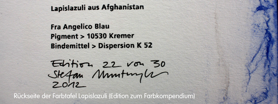
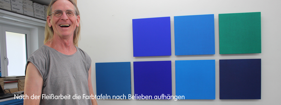
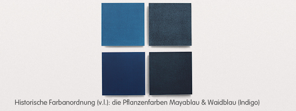
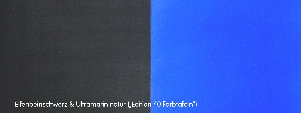
Once the monochrome colour panels are finally finished with perseverance, the strict concept allows free combinations according to various criteria. In this way, colours can be viewed on their own so their colour force can be captured or they may be enjoyed as a colour composition in interaction with other colour panels. "This gives me the shivers," reveals Stefan Muntwyler and recommends the combination of natural ultramarine blue and ivory black.
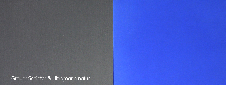
Ivory black in itself is incredibly velvety, deep and mysterious in its effect on the viewer. The interplay of the two strong colour pigments is breath-taking. Natural ultramarine blue and grey slate appear pleasantly elegant and calm as a duo.
The Book: "Farbpigmente Farbstoffe Farbgeschichten"
The compendium, first published in 2010, describes 320 pigments and dyes. It also tells colour stories from the first colours of mankind to the new pigment class of Ferrari red. As you can imagine, the book was quickly out of print and is currently no longer available. But there is hope for all those who can be patient until 2017. The book will then be reprinted in its third edition, completely revised and expanded to include "historical yellow colourants".
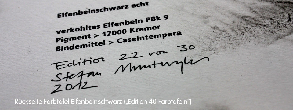
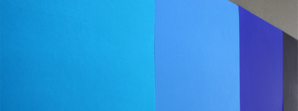
The "Edition 40 Colour panels" is a top quality handcrafted addition to the reference book, documenting the colour stories. These colour panels allow the viewer to experience the incredible luminosity of the pure, unmixed colours directly and sensuously. It is like a real frenzy of colours when you put the colour sheets in a row and them in. It is very informative and stimulating to look at two to three shades in combination with each other. With these intense colours you can continue to combine and never stop - because it is so beautiful. Thank you, Stefan Muntwyler!
More information about Stefan Muntwyler is available at: www.stefanmuntwyler-pigmente.ch
New dates for the "Colour Stories" events will be published in 2017.
Sources
- 1 – from "Das blaue Buch", Greno Verlag 1988
- 2 – from Goethe's Theory of Colours


