- Design
- Consultancy tools
- Learning worlds | Colour worlds
Learning worlds | Colour worlds
Colour concepts for children and young people
Together with the University of Applied Sciences and Arts (HAWK) in Hildesheim, Caparol has developed the design tool, Learning worlds | Colour worlds.
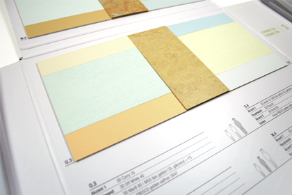
The collection, consisting of three collage books, and a leaflet supply diverse suggestions for the interior design of educational establishments - formed on the basis of design principles, visual ergonomic aspects, knowledge of developmental psychology and the HAWK study "Colour and emotion". With linoleum floor coverings from Forbo Flooring Systems colour compilations are shown for the floor and wall with which rooms can be designed practically and holistically.
The three collage books of the collection Learning worlds | Colour worlds display various colour worlds. Each colour world is defined by two colours to which in each case an equalising paint is assigned. Within this colour spectrum multifaceted room atmospheres can be generated - between the poles of active stimulation and calming harmony.
- Colour world 1: Red-orange with equalising colour green
- Colour world 2: Yellow-orange with equalising colour blue
- Colour world 3: Blue-green with equalising colour yellow
In order to achieve positive learning environments, the local conditions, architecture, room function and the user group have to be considered during the selection and implementation of the illustrated colour concepts. Therefore, for orientation the colour and floor combinations are subdivided into three user groups and three room types/ functional areas.
For the three user groups :
- Children from the play-school, kindergarten and primary school areas
- Young people from the middle school
- Young adults from the upper schools, vocational schools, academies or universities
the collection offers graded design suggestions which take into account specific fundamental development features. The main attention in each case is on the choice of the suitable colour contrast and colour saturation. For example, slight contrasts and pastel colour nuances are recommended for small children, but with increasing age stronger contrasts, more intensive but also veiled colours can be used.
The room types/ functional areas are differentiated according to the duration of stay:
- Rooms with longer periods of stay (class rooms, group rooms, auditoriums, etc.) should give an ordered and clear impression, offer visual stimuli appropriate to natural viewing habits and not deflect from that which is taking place.
- Rooms with a medium period of stay (tea-break areas, cafeterias, lounges, dining halls, etc.) should have an atmosphere ranging from pleasantly relaxed through to stimulating. Depending on the room size, different atmospheric zones can be created.
- Rooms with a short period of stay (entrance areas, stairways, corridors, sanitary areas, etc.) can stand more striking contrasts. Colours with high saturation are permissible, preferably in combination with equalising colours.
In the collection, collages with genuine Caparol surfaces for the wall and suitable linoleum floors from Forbo are presented. The leaflet provides background information, pictorial examples and gives an overview of the collages.


