


Facade Design
Corporate Identity, CI for short, represents the self-image of a company - its philosophy, vision, mission statement, and working method. It embodies the entirety of all the characteristic features that characterise a company and distinguish it from other enterprises.
Corporate Design, CD for short, describes the visual identity of a company. Corporate design is a visible expression of corporate identity, i.e. the comprehensive public image. It can be seen, for example, in the design of company logos, letterheads, business cards, and online presences, as well as workwear and façade design.
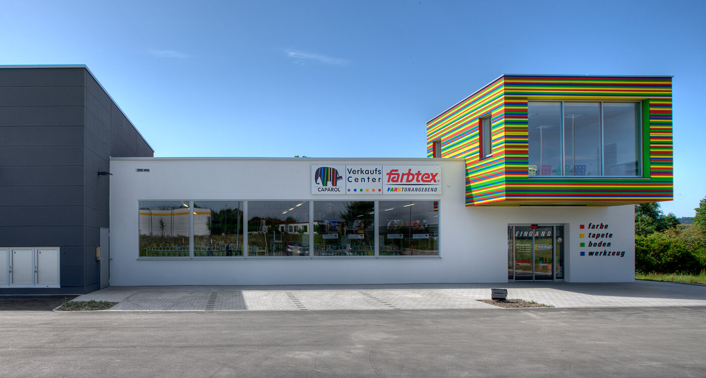
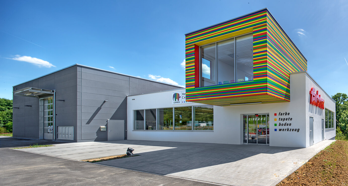
Corporate Architecture means the design and colour scheme of the company buildings. It is part of the corporate design and is intended to make the corporate philosophy visible in the public realm through architectural signs and to increase the brand's recognition value.
Colour Design under the Banner of Brand Development
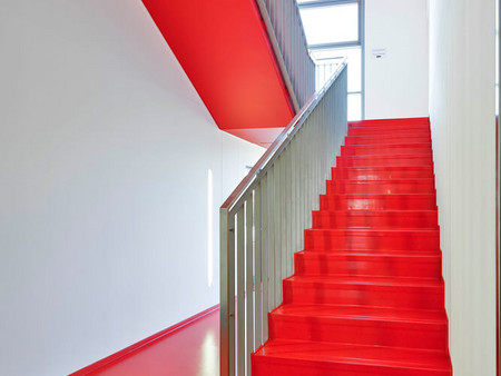
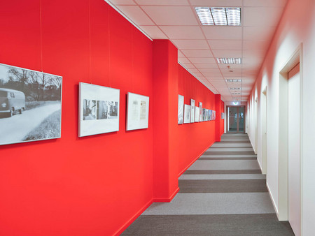
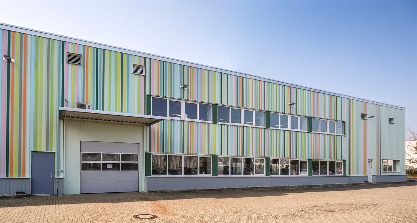
Brands are a valuable asset. They need intensive and sensitive care. They should remain familiar - and yet continue to provide fresh stimuli. The successful contribution colour design can make to the complex process of brand development is demonstrated by the new headquarters of the paint wholesaler Jedele in Aalen-Essingen.
Design Process and Design Variants
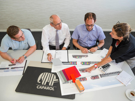
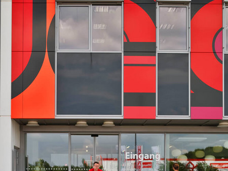
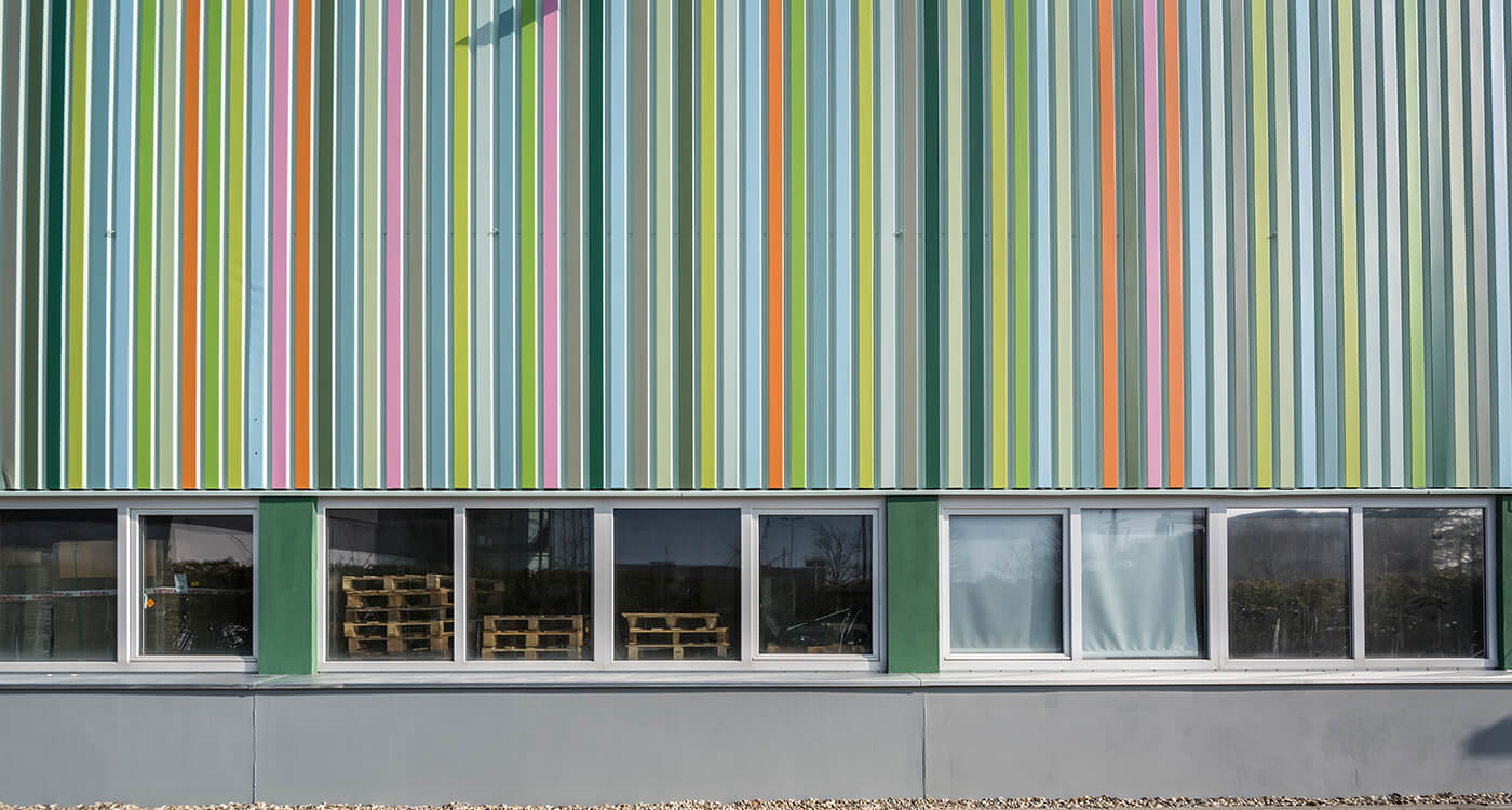
In close cooperation with architects and clients, an appearance tailored to the Jedele brand was developed: starting with an initial idea of a black facade and colourful panels and ending with an individual concept in the corporate colour combination of red, black and white, which was, however, reinterpreted.
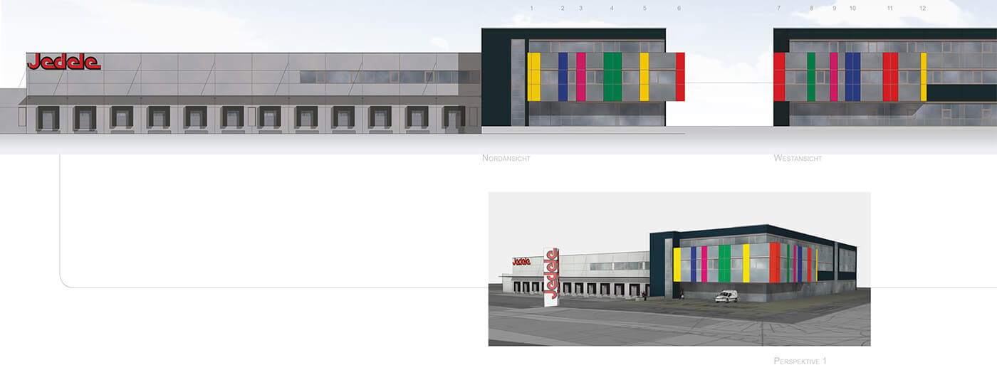
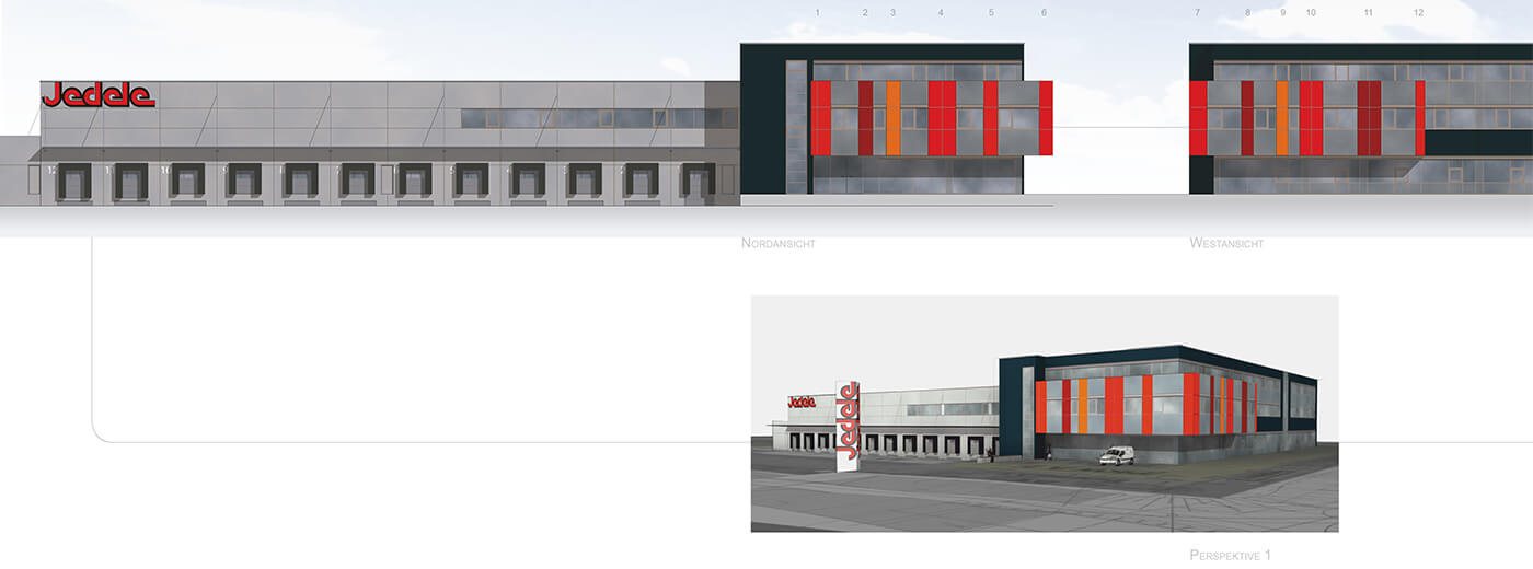
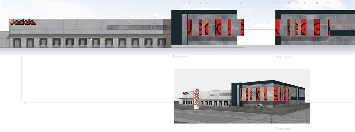
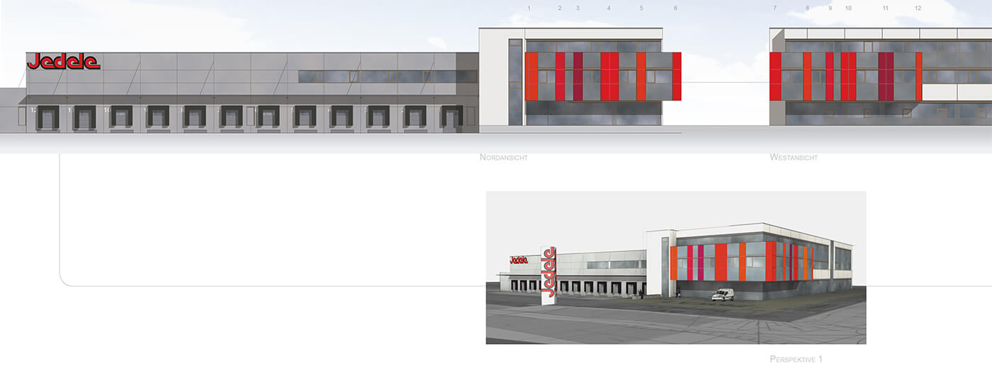
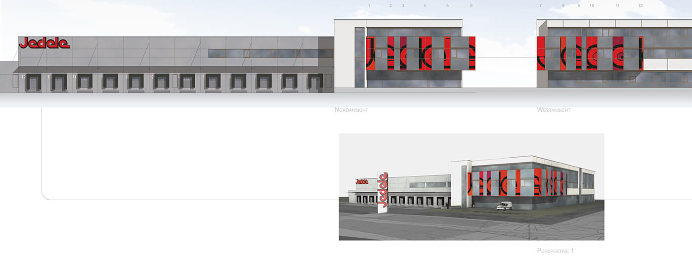
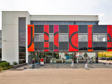
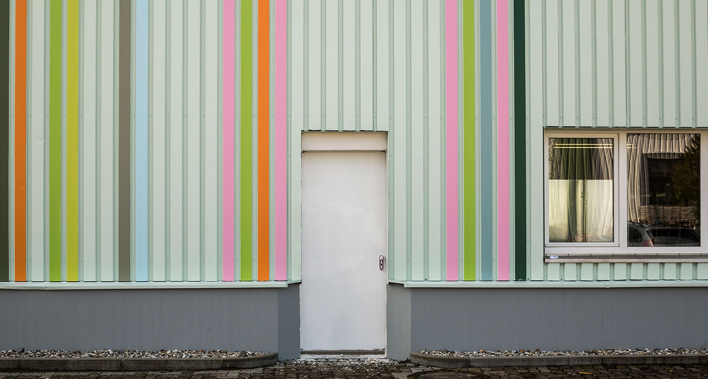
The result is a clear façade with a white background, structured by accent colours in a variety of reds. From Jedele corporate red to red orange and magenta to luminous neon red. The broadening of the colour range by further red nuances brings the brand language into line with the current "Zeitgeist". And it doesn't stop there - the design integrates the company name as a graphic element into the glass façade. The design is also innovative: writing and shining red shades are applied as film on the glass panels. After 2 to 3 years in sunlight, varnishes in the red colours would have lost their brilliance.


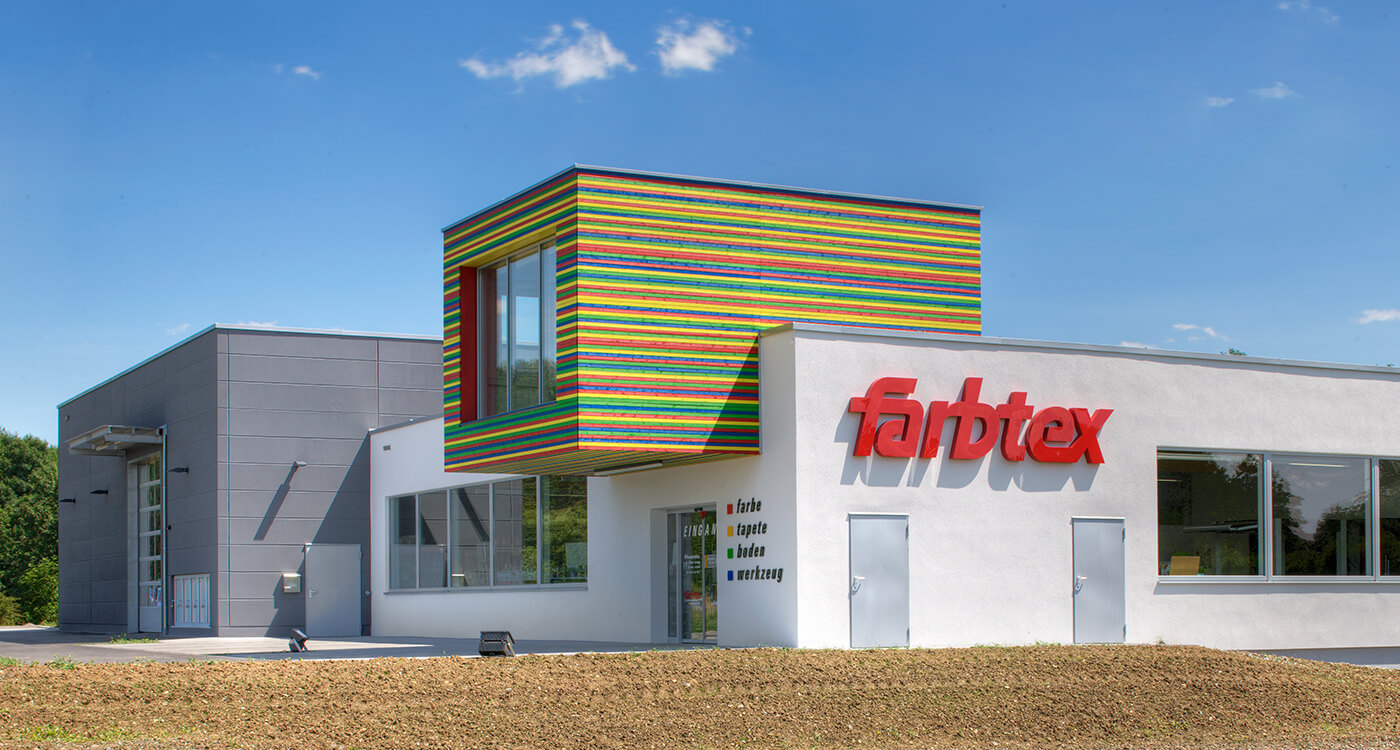
Even from the through road, the modern complex with its innovative colour design attracts attention. As you get closer, the details unfold that make this commercial property something special: a convincing element of the corporate identity of a more than 100-year-old family business with a strong brand.
More about the company philosophy and the implementation of CI can be found here.
Details on the development and implementation of this concept can be found here.
Photography: Martin Duckek, www.martinduckek.de
Support text: Charly Kahle, www.worteschaffenwerte.de
Sources: https://de.wikipedia.org/wiki/Corporate_Identity