


Facade Design
Facade Design of a Slightly Different Kind
Graphical - painted - good?!
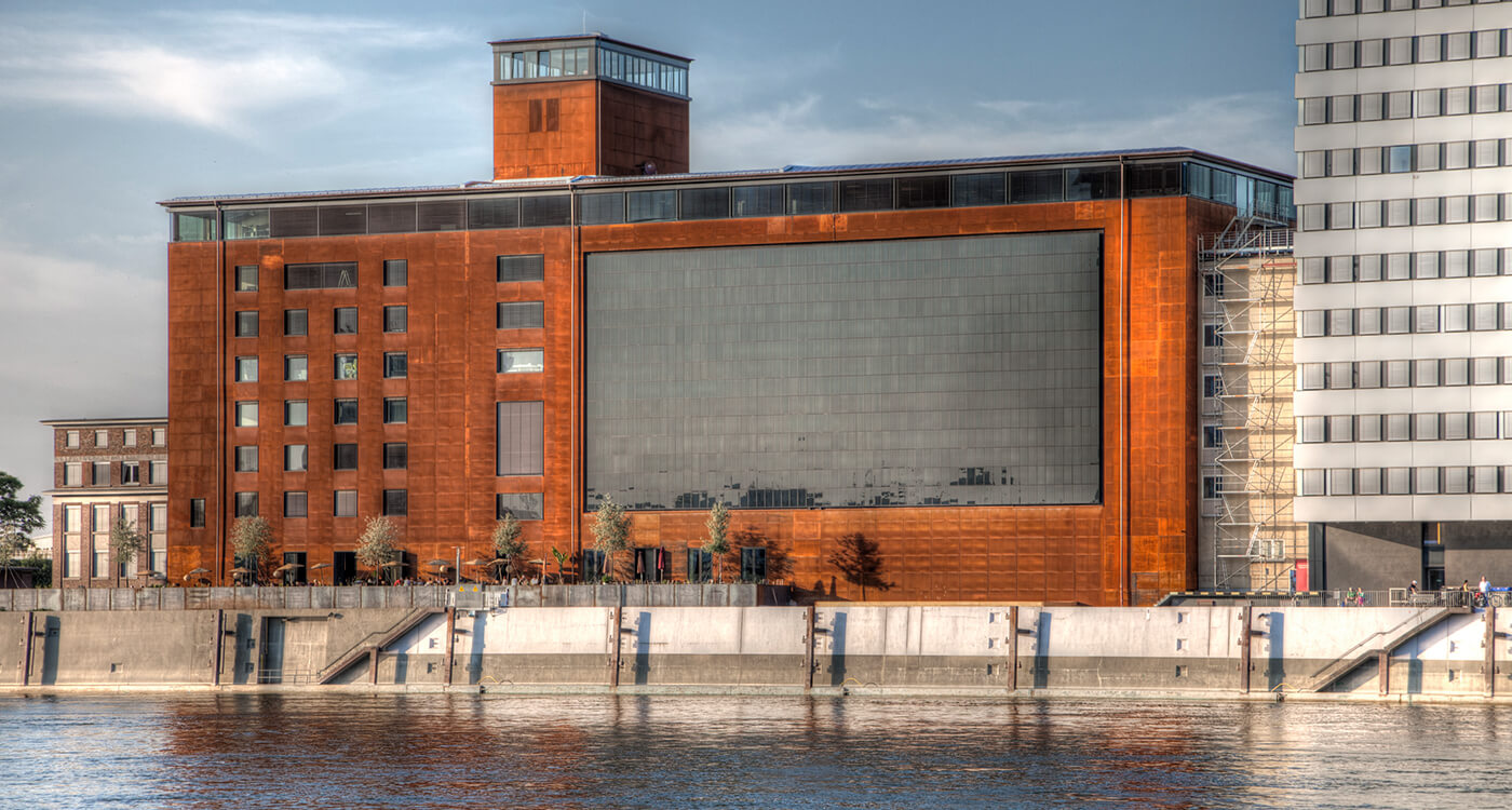
At Mannheim harbour, a post-war granary was converted and is now used as the office of architect Peter Schmucker, the "Speicher 7" Hotel and the "Marly" Restaurant.
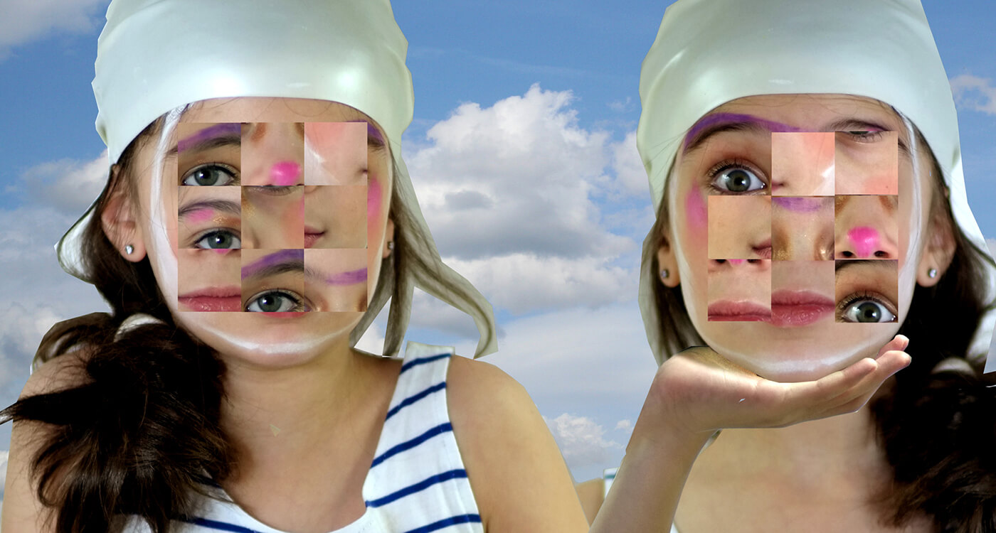
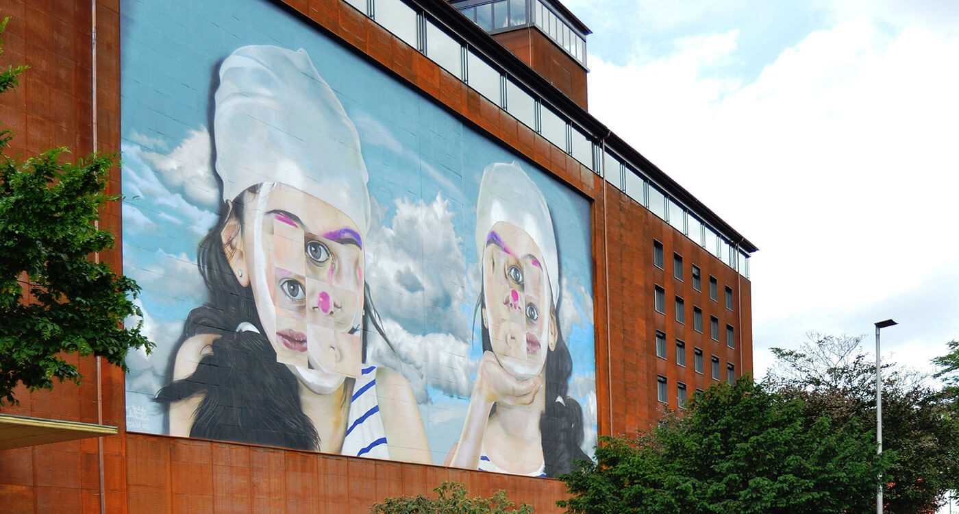
Street art artist Andreas von Chrzanowski, "Case", from Frankfurt/Main, painted and sprayed two square faces on the street-side facade in "The City of Squares".
In the context of owner inquiries, cooperation with educational establishments and other institutions, as well as occasionally in special sponsoring campaigns, it happens time and again that a facade is not only designed in terms of colour on a very large area. Sometimes something special is to be achieved, whether to embellish a not so attractive, because too plain or empty looking area, to convey what is happening in the respective building - if for example functions are to be discernible directly on the facade - or if a special aspect of the environment is to be represented!
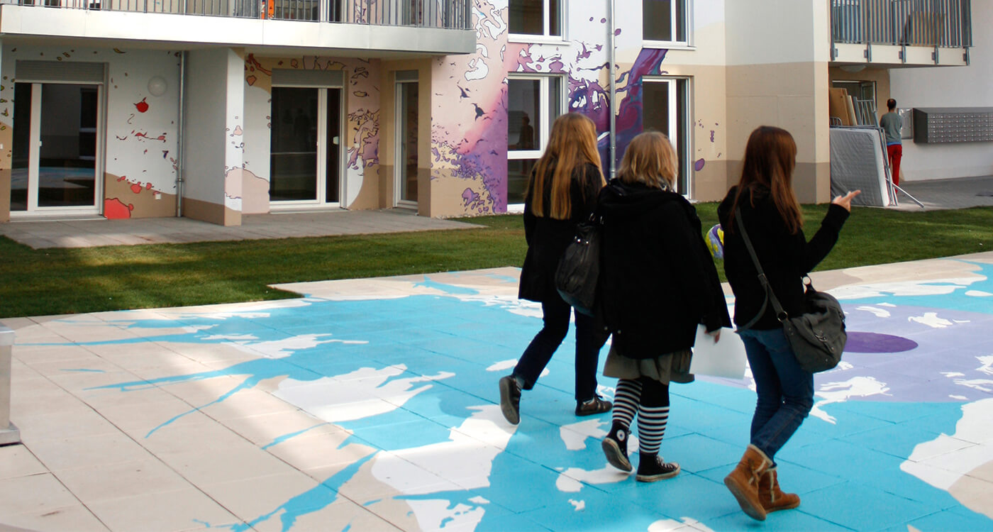
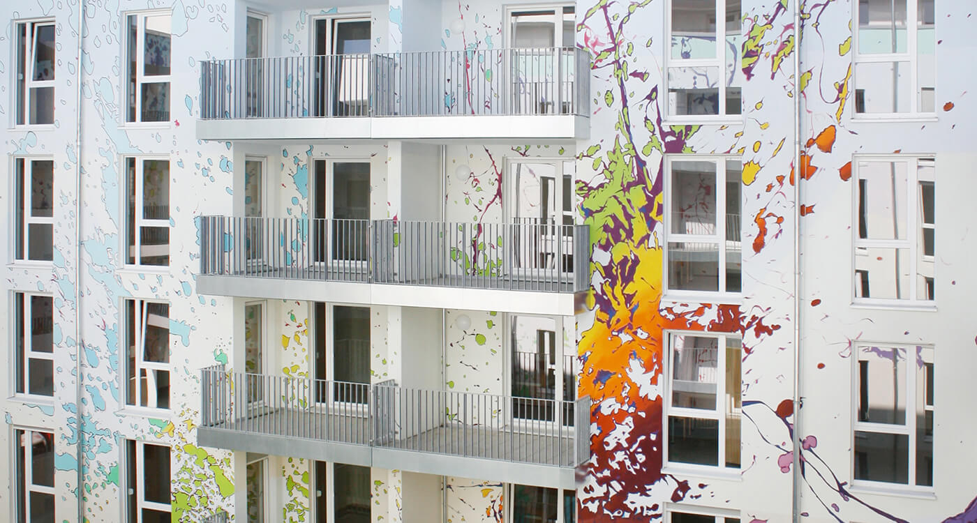
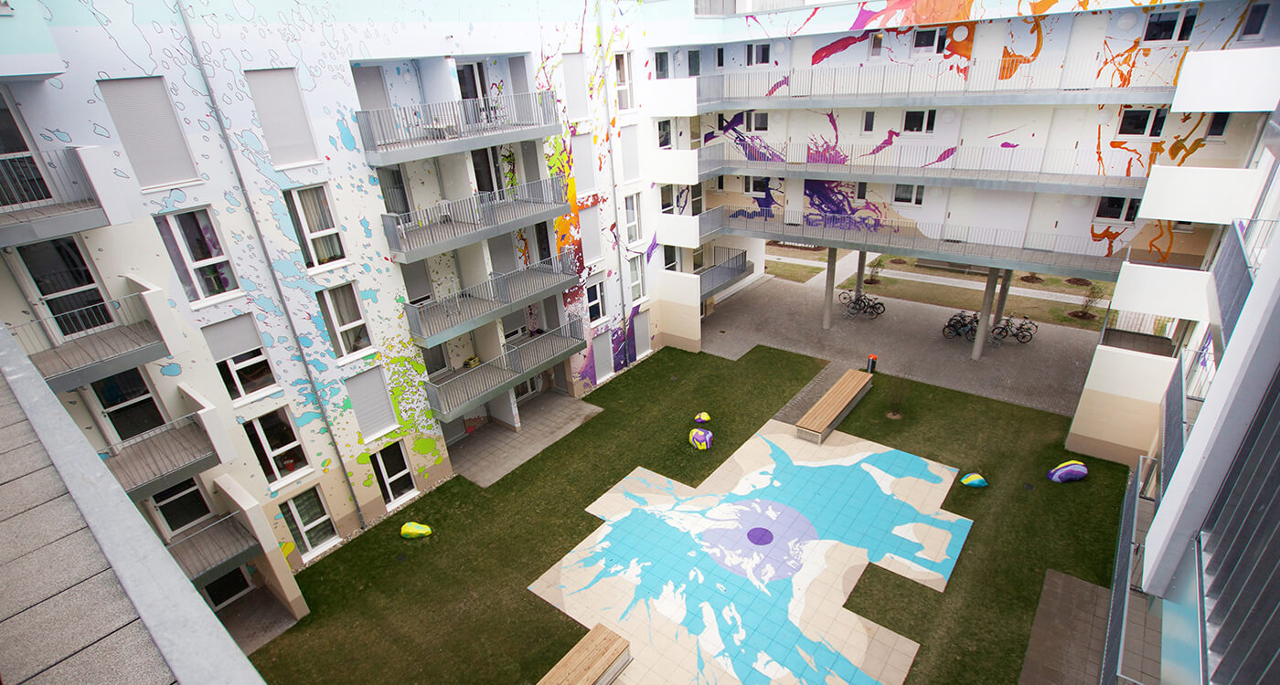
In Darmstadt, for example, a student residence 'explodes' with the help of artist duo 'Umgebungsfarbe'...
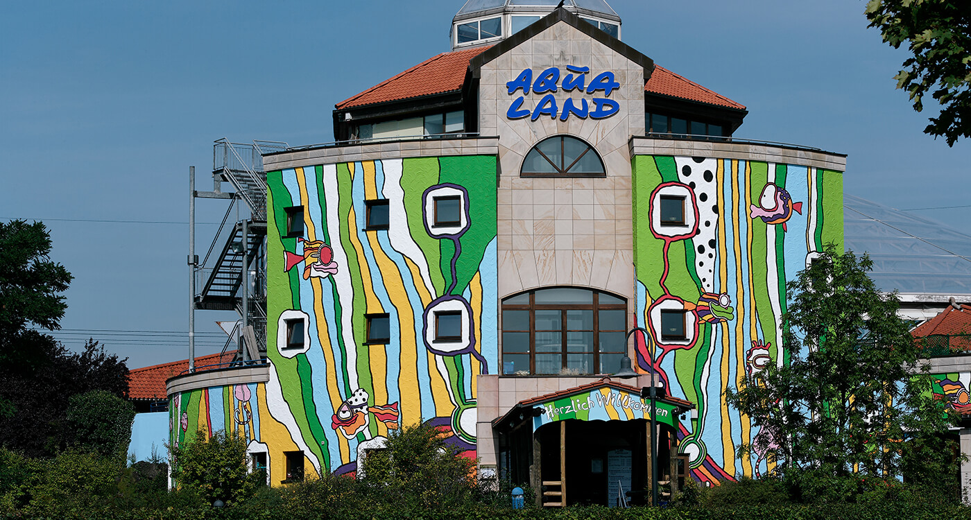
In 2006, artist Carsten Kruse from Hirschberg an der Bergstraße captured an underwater landscape on the facade of the "Aqualand" adventure pool in Cologne. Fish and other sea creatures romp around in the waves - just like the visitors in the water world.
In 2014, the artist gave this building complex a new look - which does not compromise the quality of this concept!
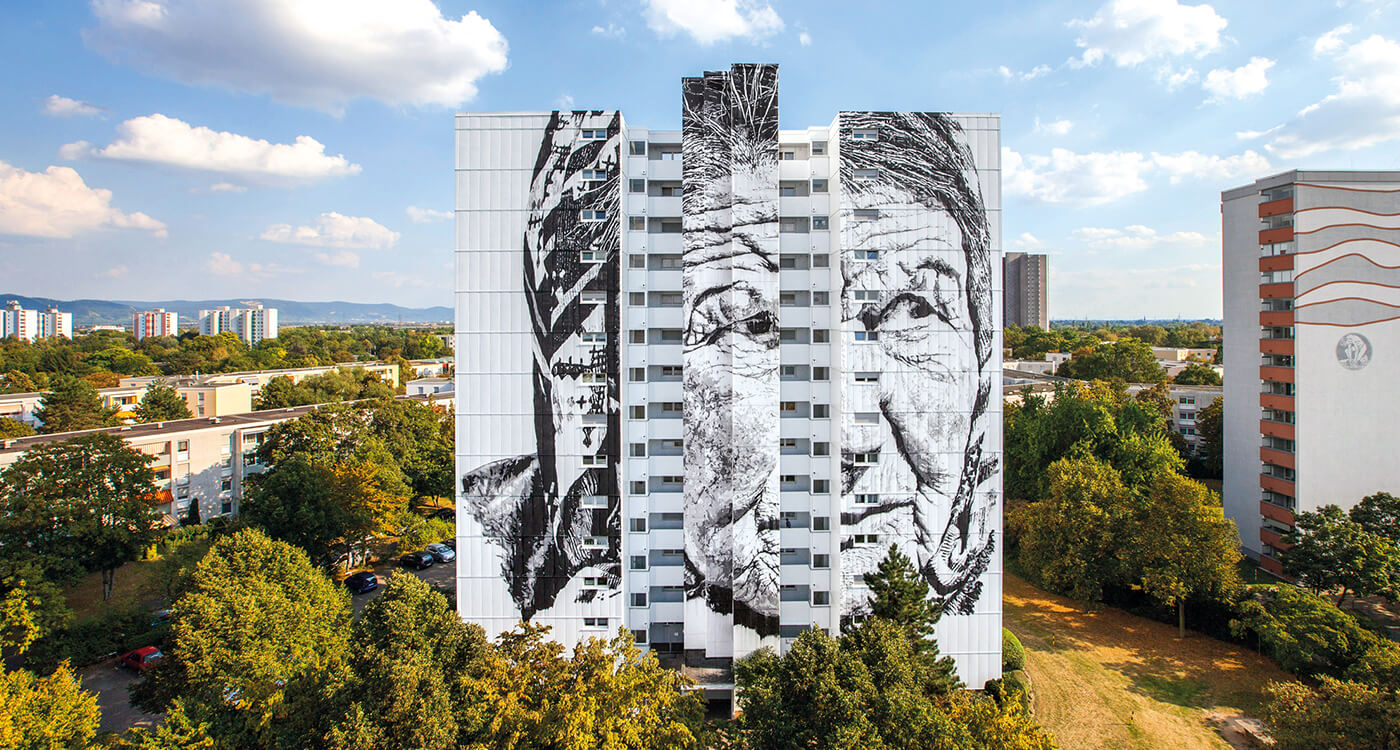
A quite challenging project in terms of execution was "Vera" in 2016, simply because of its size! Artist Hendrik Beikirch was in charge of creating the portrait on a wall of a high-rise building as part of the Stadt.Wand.Kunst project of the Alte Feuerwache Cultural Centre in Mannheim, with a total of 60 participants.
From time to time, and where appropriate and requested, the designers at the ColorDesignStudio also develop graphics and other artistic contributions for facades.
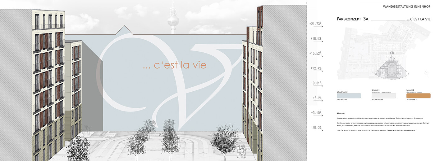
In Berlin, for example, a fire wall is painted to make you forget that it is a wall of enormous dimensions. The colour shade is chosen so that the association to a friendly blue sky unconsciously enters your mind ;-). The content of the typographic elements refers to the residential neighbourhood.
This is another example of a 'message' on a facade gable in a residential complex in Pfungstadt. The idea of co-operative living gets a sympathetic touch in text and image: Welcome to the community!
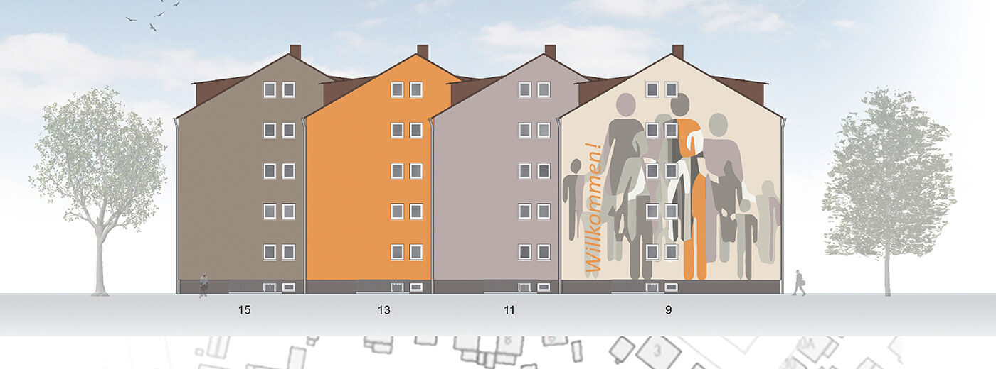
GeWoBau Pfungstadt e.G.
And we are happy to support and act as intermediary!
…as, for example, for the open-air exhibition of Kunsthalle Schirn in 2013 in Frankfurt,
or a student term project for maintaining the cultural budget 2010 in Dessau.