


Facade Design
...from ugly duckling to beautiful swan!
Completed projects in before-and-after comparison
At first renovated and insulated to technical perfection, then upgraded and individualised with colour.
The development of the concept was preceded by a structural analysis. This provided answers to exemplary questions such as: which colour scheme corresponds to the architecture, the existing social structures and the environment itself? In addition, the size and height of the buildings were taken into account, as well as the building materials already used in the surrounding area.
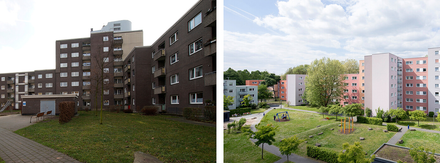
The residential area is divided into three large blocks. This is also emphasised by colour.
"The colour concept gives the whole ensemble a harmonious structure and appears very varied, especially with regard to the long streets. Our first proposal met with great approval and could be implemented," reports the colour designer with satisfaction. Thus, the quarter was divided into three colour areas according to the arrangement of the buildings. An effective colour gradient in veiled red, green and blue-violet shades now skilfully brings the facade to the fore. The bases of the three building sections, also painted in different shades, underline the new character of the residential complex. The balconies and areas between the windows in grey-white prove to be a connecting element that sets additional emphases and supports the friendly, varied exterior. The new, harmonious appearance of the residential quarter has thus achieved a high recognition value.
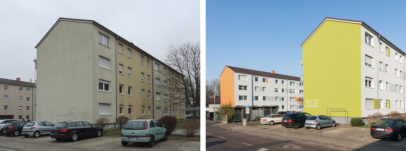
"First of all, we differentiated structurally identical buildings by means of the colour scheme," Petra Ruhnau explains her design approach. Vivid colours restructure the building facades. The first eye-catchers are the fully painted gables in orange and green. The design places strikingly and resolutely veiled earth orange next to muted olive green. Blue accent shades take up the colour of the entrance door and windows of the staircases and visually integrate them. The bluish white of the facade's basic colour conveys freshness and modernity, which is effectively brought to bear by the anthracite base.
However, the jump into an urban presence worth living in does not succeed through colour alone. It is also the visual structure of the facade that invites a playful examination, leaves room for fantasy and animates through the alternation of the apparently familiar and a modern design language. Thus, the coloured accent fields sometimes look like shutters, then like shapeless colour codes. The asymmetrical arrangement is based on a system - but this is not immediately discernible and allows the view to linger on the facades.
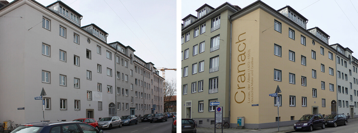
For the block of houses on Loth-, Hess-, Cranach- and Schellingstraße there was a desire for a holistic colour concept and a reference to the artist `Cranach`, who is the namesake of one of the four streets. The colour selection is defined by three facade colours from the yellow-green range. The corner sections of the block are finished in colour-intensive yellow that frames the building and creates a harmonious interplay of colours with the other shades. The bays are finished and highlighted with a colour contrasting that of the facade. Entrances and window surrounds are particularly emphasised by the intense malachite hue. The fine colour contrast looks elegant and inviting. The writing 'Cranach' could be prominently placed on the recessed gable.
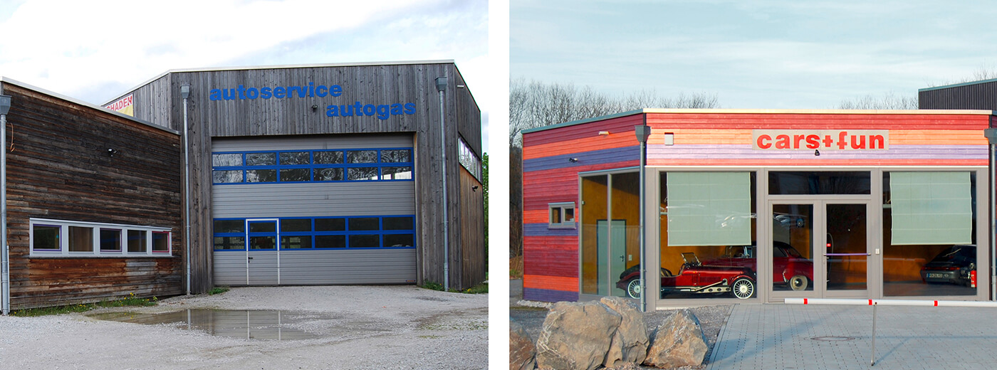
"For the prestigious showroom area, I then decided on a colourful and warm design in accordance with Caparol's recommendation. It reflects the bold colours of classic cars," says Luce, whose family business can look back on a 100-year company history. Today, the showroom shines in bright natural shades ranging from pearl blackberry and salmon to grenadine, which have been applied in horizontal stripes.
The colours are all from Caparol's Capadur Silverstyle series. "These wood glazes with a silvery sheen correspond to a trend towards natural wood facades, which has become increasingly popular in recent years," explains Caparol product manager Bernhard Linck. "The natural surface of wood shows to its best advantage with this effect varnish. At the same time, this enables individual colour design even beyond the classic wood shades." By contrast, Luce used a subtle, natural wood shade from the Capadur Silverstyle series to revamp the workshop facade. In the overall picture of the building ensemble, the workshop is now unobtrusively pushed into the background.
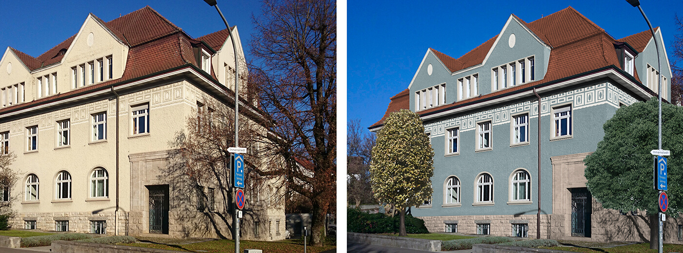
The villa, built in 1908, has served as the administration building for Rheinfelden Wohnbau since March 2017. Before the company moved in, the building was extensively renovated.
For the new facade design, a greenish blue shade was combined with the existing yellow sandstone. The contrast of cool facade to warm-toned stone emphasises the existing decorative elements. With this design, the facade asserts itself all the more in its exposed position next to the bridge across the Rhine towards Switzerland.
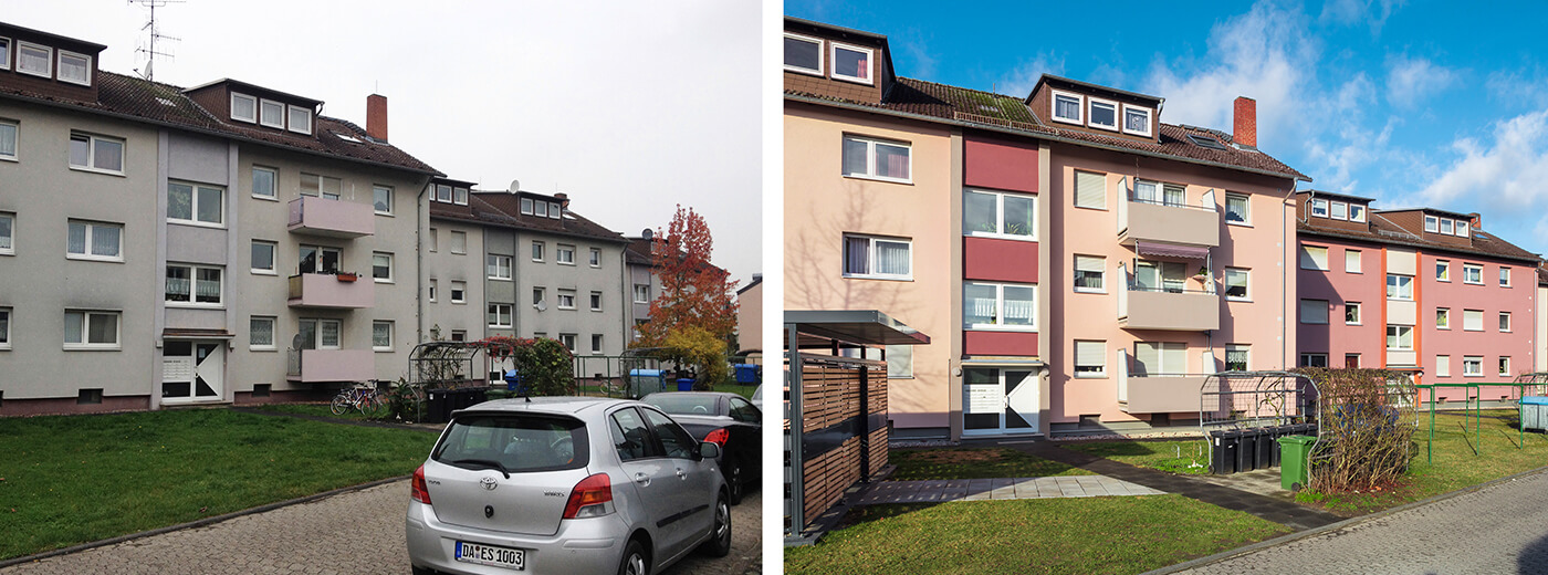
The impression after painting is far more friendly. Each of the three houses has its own appearance. The interesting thing is that the colours are related to each other. This gives the ensemble its individual character. The facade colour of one house appears on the other buildings in a more saturated shade as a highlight in the entrance/staircase area or on the balcony balustrades.
You can find out more about the Caparol ColorDesignStudio here.
As well as about the Caparol Colour Collections and our consulting tools.