


Facade Design
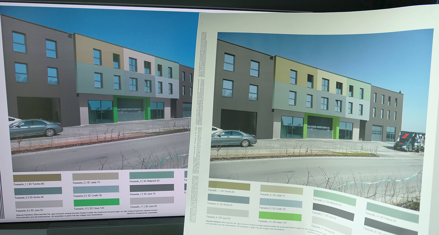
One colour, two media: screen versus printout
Why do colours look different on the screen?
Who doesn't know this: On the monitor the colour shade looks exactly right - and in the printout it's completely different! How is that possible?
What we see on the screen are light colours. By superimposing the three primary colours red, green, blue (=RGB) in varying intensities and proportions, the screen mixes the colours to be displayed. When all 3 colours are mixed together, we see white. The range of colours that can be displayed on the respective screen is referred to as the monitor colour space. Depending on the model, there may be differences in the colour range that can be displayed.
Interesting: The human eye sees more than a screen can display! Not all colours that the human eye can perceive can be reproduced in the RGB colour space. And in print? Here, of course, we do not work with light colours, here the classic four-colour printing is mostly employed, we speak of the CMYK colour space. This designation consists of the abbreviation for the three colour components cyan, magenta, yellow, complemented by the black component key. These colours are printed on top of each other and thus create a colour tone. The more colours are mixed together, the darker a colour becomes.
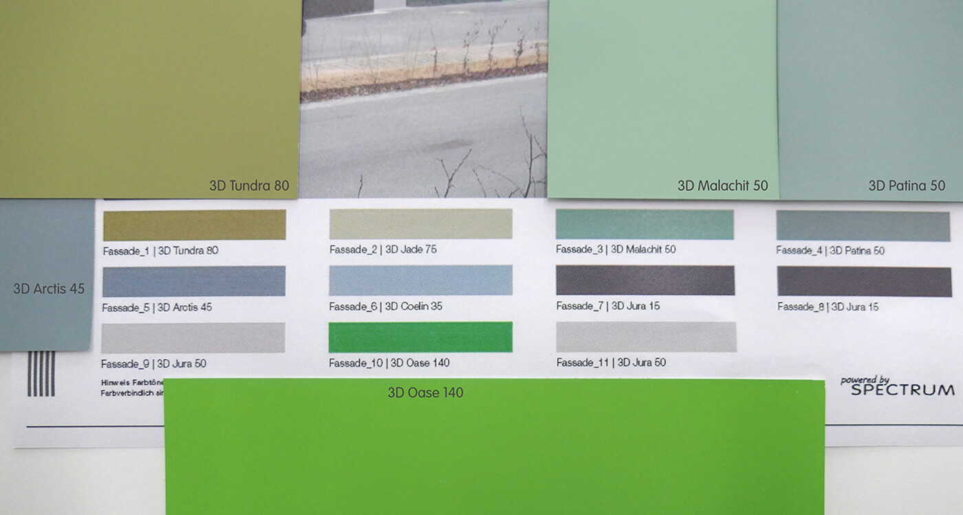
Interesting: CMYK includes fewer colours than RGB. Special inks must be used for printing, especially for very radiant colours. Of course, the classic home printer is not able to do this!
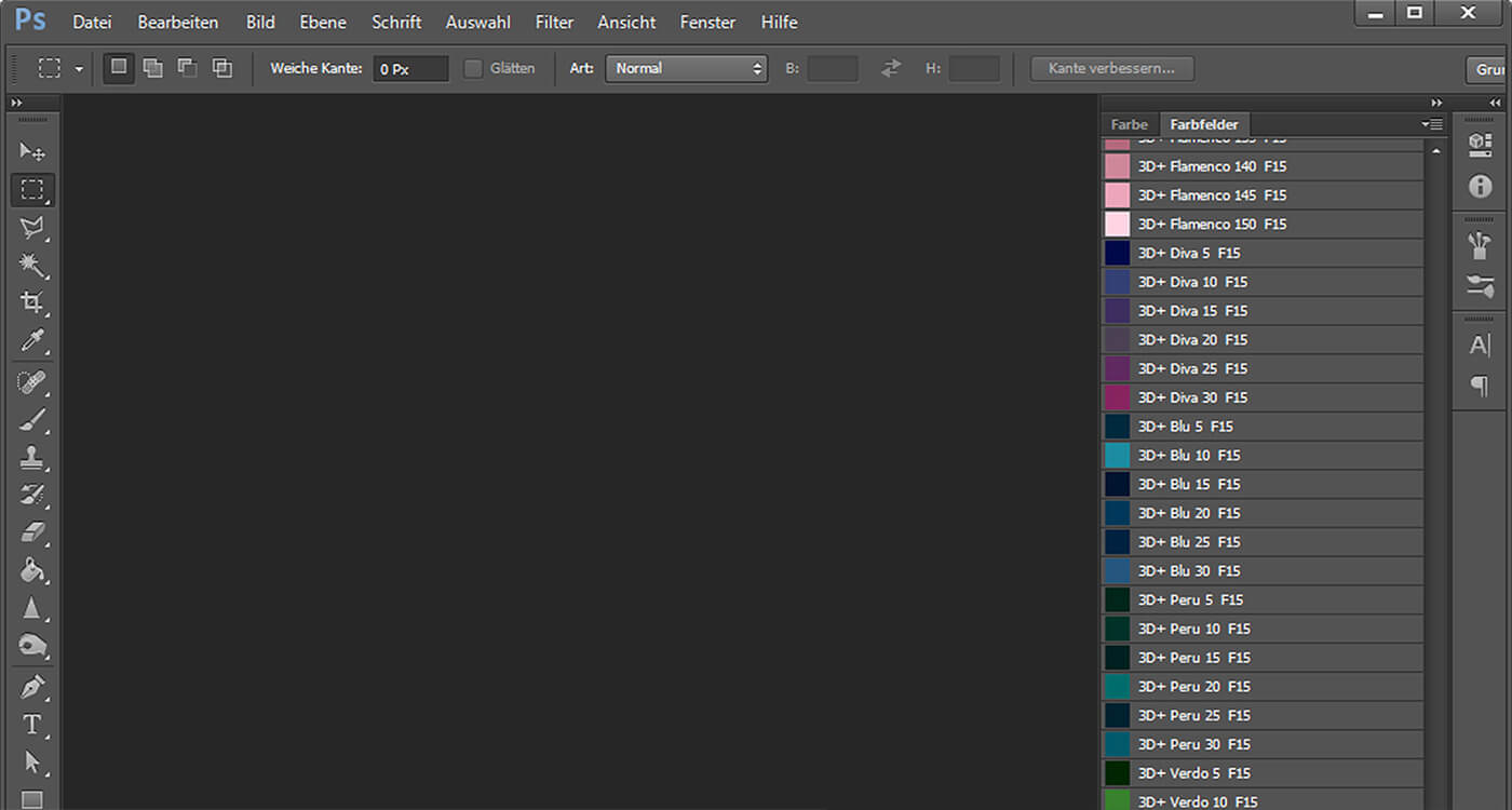
We therefore work in two different colour spaces in which the selected colour shade should look as identical as possible. In order to coordinate both color spaces, all monitor and printer data required for the design with Caparol colours are available for free download via this link.
It is also recommended to calibrate the display. To do this, you will find a system tool on your PC under "Appearance and Personalisation | Display" via the link "Calibrate colour". As a rule, the printer also offers a calibration option.
If you have successfully completed these steps and the file to be printed is in CMYK format, the colours will normally come quite close to the desired result when printing on high-quality paper. However, in order to be able to test the final effect on the façade, a test area in the desired colour directly on the building is the best advice.
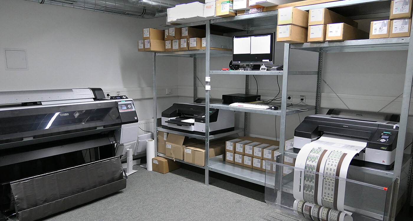
Interesting: In the professional sector, colour management, special printers and papers are used. Ideally, the devices are located in air-conditioned rooms, as strong fluctuations in temperature and humidity can also influence the printing result.
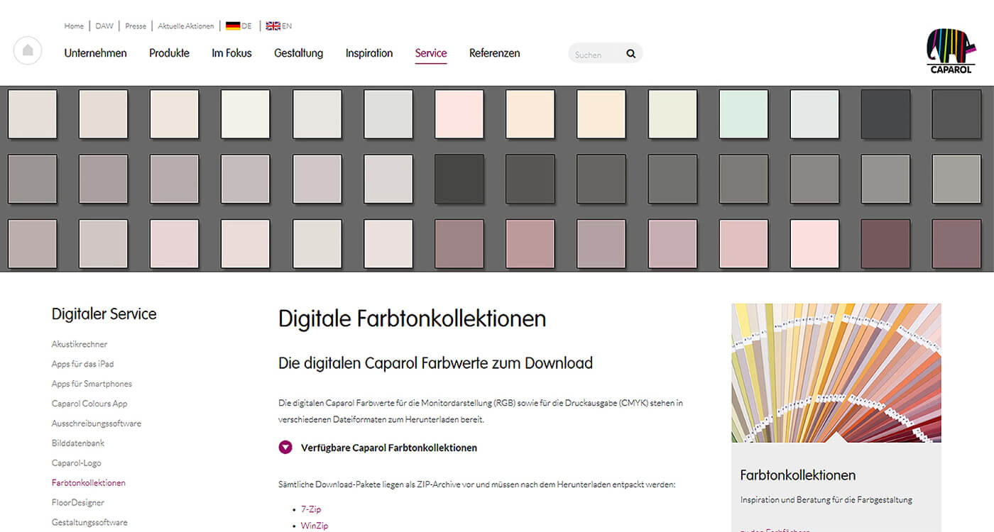
You can download our digital colour collections here.