


Trend 2017
This is how a colour concept is created
Trends have many facets. There is no one trend colour, but colour trends appear in several shades, but above all in colour harmonies. Frequently, it is the new combination that makes a colour world trendy and up-to-date. Our example leads back to the ambience of the 70s and 80s. Brown as far as the eye can see in the four walls: dark brown tiles in the bathroom, earthy shades on walls and ceilings in the living room. Often combined with orange or olive green. Now brown is back!
Comeback with a Difference: Brown and Cognac
Brown is back - it celebrates its comeback, but in the form of an elegant cognac shade. It has lost its dark, heavy character of the 1970s and 1980s and appears warm, elegant, natural. Now we like brown again, we take to it. So, what happened?
If we look closely we notice that the new brown is not alone. A bright, intense ultramarine accompanies it. We haven't seen this before. It's new and exciting. The colour itself is not new, but the nuance in this combination.
The combination plays an important role. The proportion of the shades is also included here. The ratio of colour shades to one another strongly influences the spatial effect and thus the atmospheric impression. The dark heaviness that characterised the style of the late 1970s was the result of the combination of brown with muted orange and olive as well as the proportional distribution on the wall and ceiling.
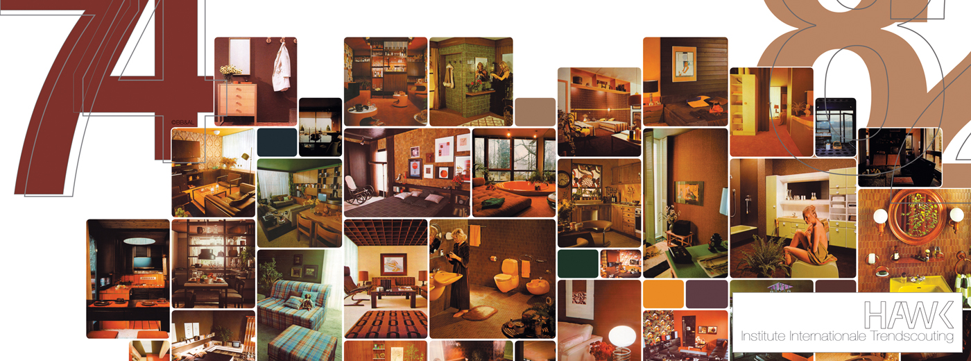
That's what we saw in the 1970s and 1980s: brown as far as the eye could see. So it is the current interpretation that leads to the new appearance of trend colours. At the centre of their development is the question: How do we nuance, combine and proportion in a new way? Our colour worlds illustrate all this.
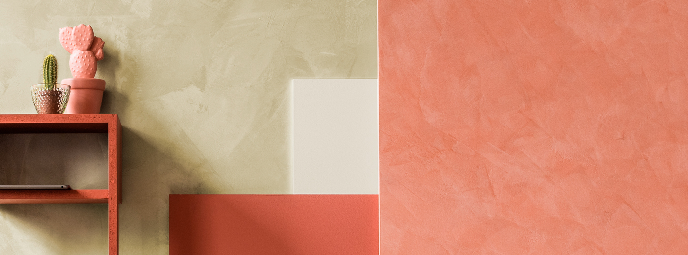
Current terracotta: anything but Mediterranean!
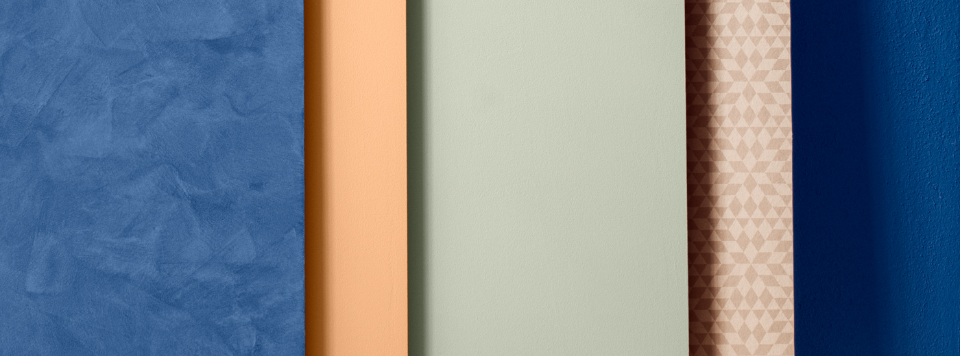
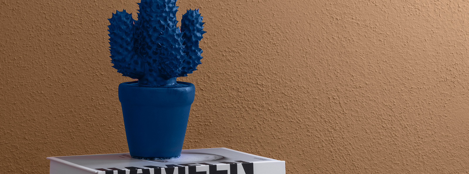
The situation with terracotta is similar to that of the brown nuances in the 1970s and 1980s: for many years, material and colour embodied our longing for the Mediterranean lifestyle. Suddenly, terracotta is in again. We have discovered what is new about it! It is light and pastel, without Mediterranean ponderousness. This is supported by a light apricot. The combination with a vibrant blue and a retro-style wall design with graphic patterns and geometric shapes ensure freshness and modernity.
Pastel yellow gains graphic clarity and coolness
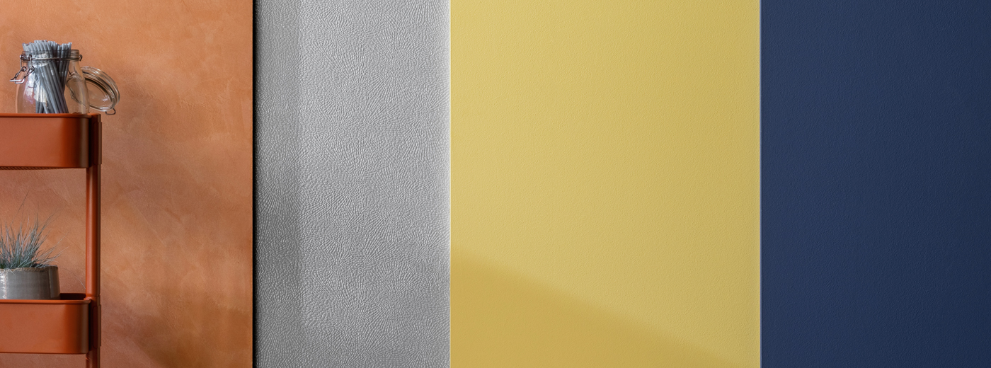
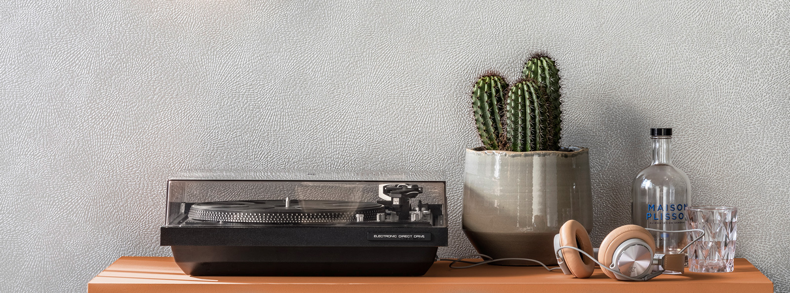
We combine the new cognac-brown with a dark, intense night blue. The combination with a light, neutral grey nuance reduces the weight and makes the warm-toned cognac shine. A light, mustard yellow tone is added. It embraces the elegance of the colour world and gives it a light, easy-going "touch".
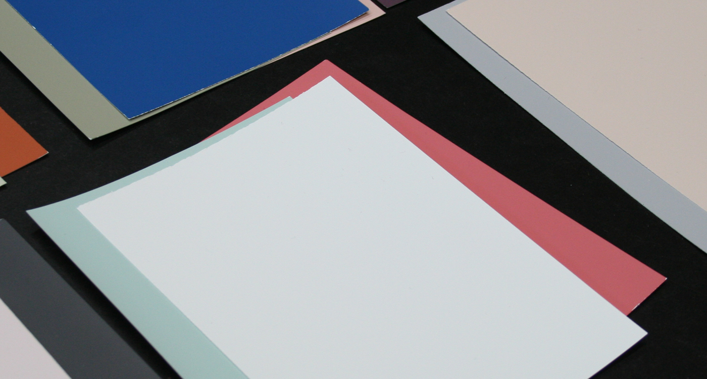
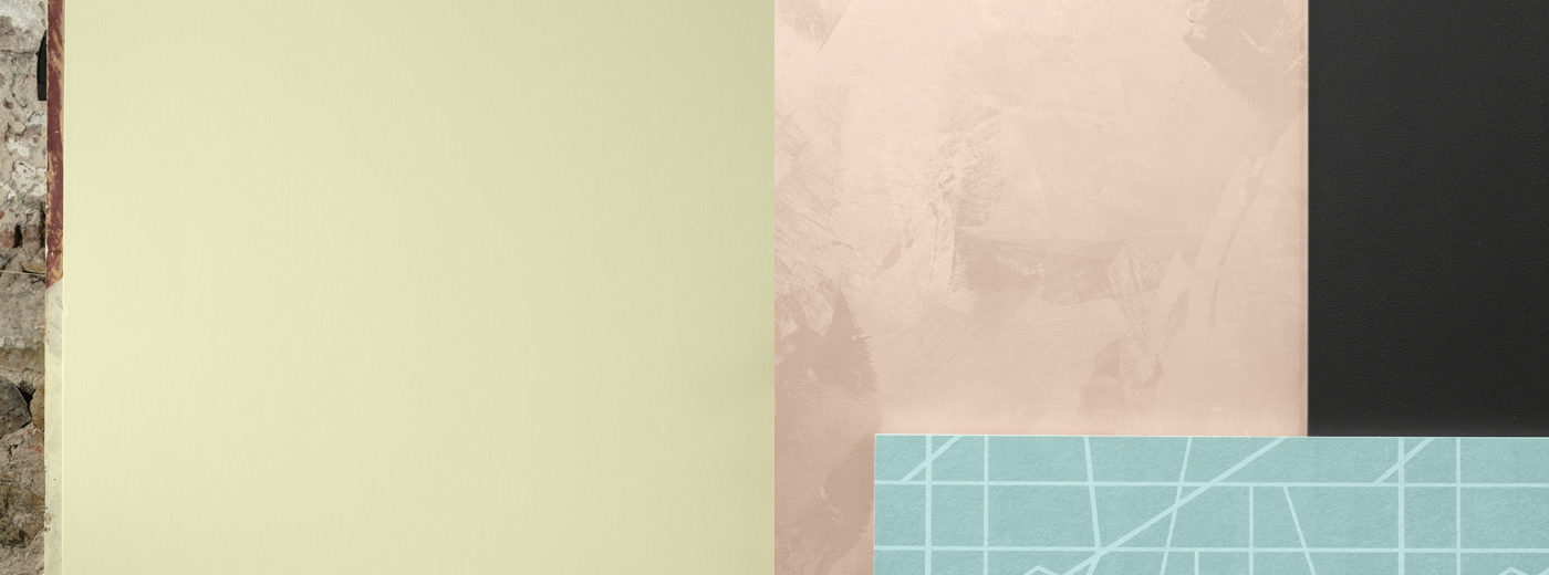
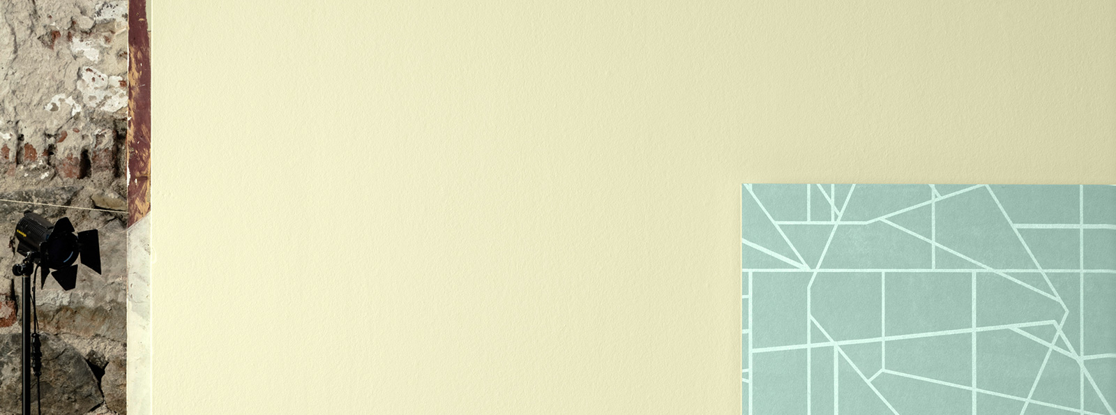
Tone-in-tone with a certain “Extra“
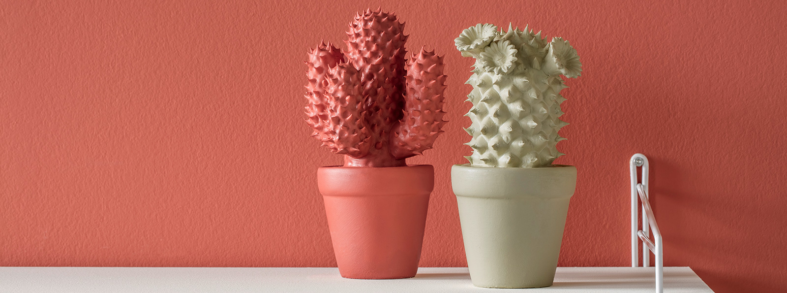
A fine, discreet ambience is created by combinations, some of which are tone-in-tone. This creates an atmospheric harmony. In our colour world, we place an intensive sorbet red next to its lighter sister - a gently softened pastel variant. We round off the combination with a mild, natural reed hue and thus ensure that certain "extra". The composition is completed by a broken white, which makes the other shades shine and gives them contours.