


Trend 2017
THREE SCENARIOS – three examples. With the help of room sketches, we show you how to optimally combine current colours and surfaces. You will find tips that can be used for most living areas. Take the chance to inspire with a special surface design that not everyone has and not everyone can do! You create a unique atmosphere with them - and leave a long-lasting good impression, not only on the wall!
Naturally Harmonious: GREEN LIGHT FOR INTERIORS.
If you like it very harmonious, but still want something special, choose the tone-in-tone combination of colour and texture. Designed in the same shade, a subtle interplay of surfaces is created: restrained but distinctive!
Tips:
Creating a calm atmosphere
Choosing the same colour for wall and ceiling: The result is an enveloping character.
Adding subtle highlights
Making the wall stand out visually by means of a texture. For example: with Capadecor StuccoDecor DI LUCE. For a very delicate, metallic effect: Capadecor Stucco Eleganza (shown in the picture).
Practical tip
If the surface is to appear particularly calm, work with small spatula strokes. This results in a subtle, cloudy texture.
An overview of all trend spatula techniques can be found here.
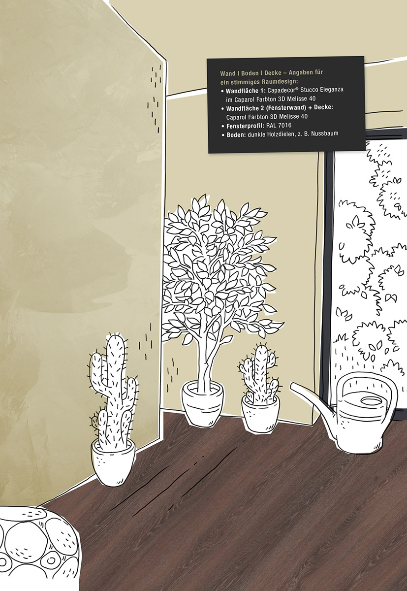
Wall area 1: Capadecor® Stucco Eleganza in Caparol colour 3D Melisse 40
Wall area 2: (window wall) + ceiling: Caparol colour 3D Melisse 40
Window profile: RAL 7016
Floor: dark floorboards , e.g. walnut

Masterful change: COMPOSITION OF VARIOUS COLOURS AND SURFACES.
THE MASTERLY CHANGE between colour, wall covering and surface is one of the greatest challenges in design. Despite different shades, patterns and structures, there must not be a lack of harmonious interplay. It depends on the arrangement and the space for the individual elements. The aim is a balanced overall impression: extraordinary and impressive!
Tips:
Producing a vivid wall painting
Combining glazing with covering coatings. For example: applying a light, silk-transparent glaze in a light to medium shade highlights an opaque, intensive accent colour (dark blue in the picture).
Using graphics as an eye-catcher
Combining graphic patterns and elements. The geometric design of the Capaver FantasticFleece Siara corresponds to the graphic element of an oversized number. Coated with a water-based varnish, the number only stands out due to the alternation between matt and glossy.
Separating different graphics with a plain colour
If graphic come upon graphic, the result can be an image that is too unsteady. A plain colour (in the picture on the sliding door) serves as a balancing bridging element.
Practical tip
Apply the glaze to Capaver FantasticFleece first, then remove excess material. This guarantees a perfect paint finish.
Wall area 1: Capaver® FantasticFleece Siara in Caparol colour 3D Onyx 115
Sliding door: Caparol colour 3D Amber 75
Wall area 2: Caparol colour 3D Saphir 95
Number with glossy look: partial coating with Capacryl PU-Gloss transparent
Ceiling: Caparol colour 3D Onyx 115
Double T-beam: Caparol colour 3D Amber 75
Window profile: RAL 7016
Floor: bright wooden floor, e.g. oak, whitewashed
Effective: THE RIGHT ILLUMINATION MAKES THE DIFFERENCE.
EFFECT PIGMENTS are often used to give a surface a special texture. Colour and gloss changes in paint and varnish can add a special highlight to a room. The eye-catchers are created by the lighting conditions and the change in the viewing angle: special glitter effects are created when presented in the right light.
Tips:
Providing lateral light
When choosing the wall, pay attention to natural lighting: lateral lighting through a window in the adjoining wall beautifully accentuates the effect on the wall surface. A window in the same wall would cast too much shadow on the wall - the pigment would hardly appear.
Specific lighting
A movable light source, such as a ceiling spotlight, can wonderfully illuminate the effect wall. A bedside light is a nice alternative to bring out the effect at certain points.
Practical tip
Depending on the colour of the substrate, a FlipFlop pigment has different effects. A pre-test shows on which shade the pigment is most effective. Here it is a grey gradation of the granite family from the 3D system PLUS fans.
Difficulty
Even the experts do not always know exactly what the result looks like! It is worth creating a sample surface to see how the different materials react - in case of doubt even in original size.
Click here to get to the implementation in the real room.
You would like to know more about effect pigments? Here we have compiled even more information for you.
Further information about the Caparol product world can be found here!
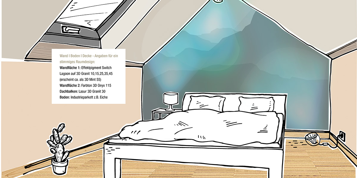
Wall area 1: Effect pigment Switch Lagoon on 3D Granit 10, 15, 25, 35, 45 (appears approx. as 3D Mint 55)
Wall area 2: colour 3D Onyx 115
Roof beam: Glaze 3D Granit 30
Floor: industrial parquet, e.g. oak
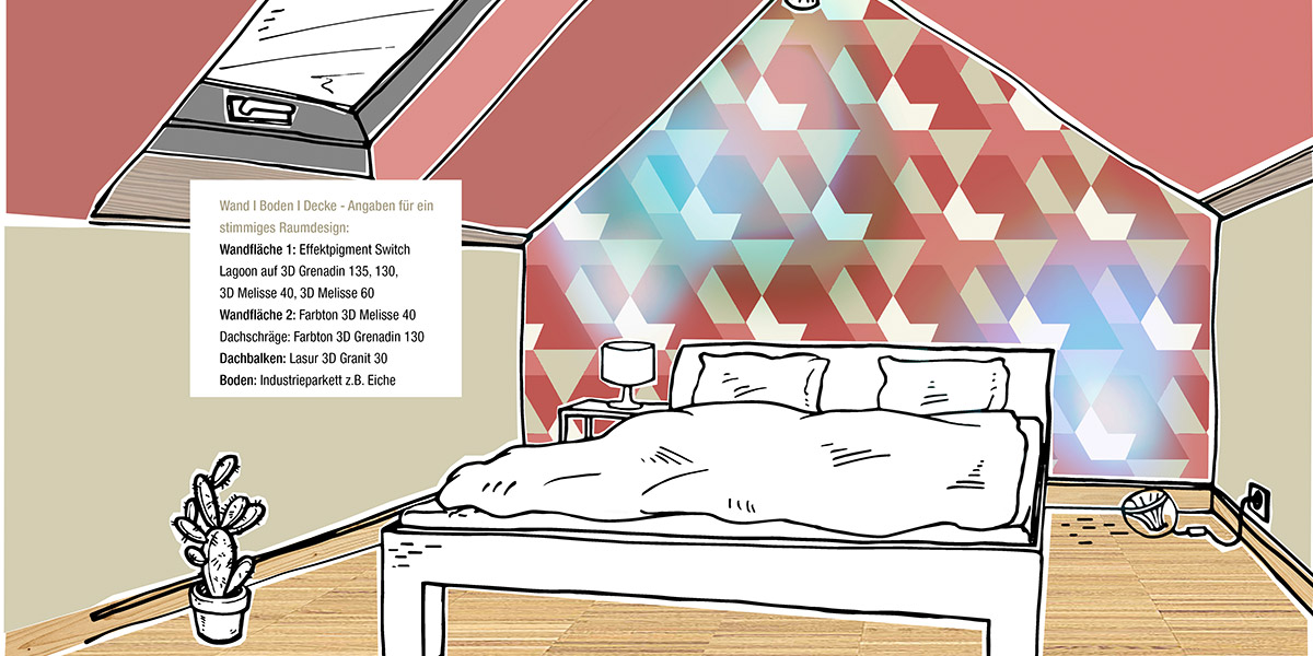
Wall area 1: Effect pigment Switch Lagoon on 3D Grenadin 135, 130, 3D Melisse 40, 3D Melisse 60
Wall area 2: colour 3D Melisse 40
sloping ceiling: colour 3D Grenadin 130
Roof beam: glaze 3D Granit 30
Floor: industrial parquet, e.g. oak