Trend 2017
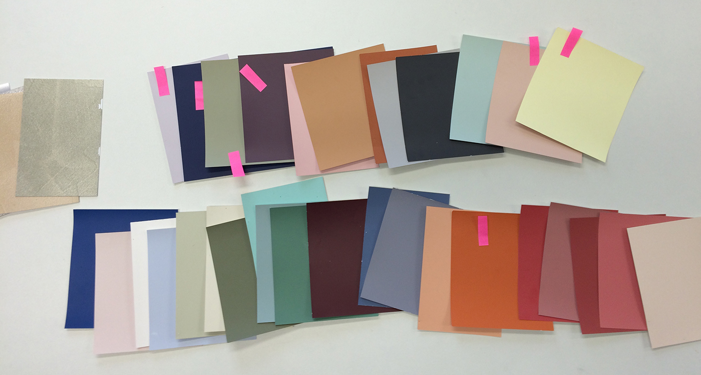
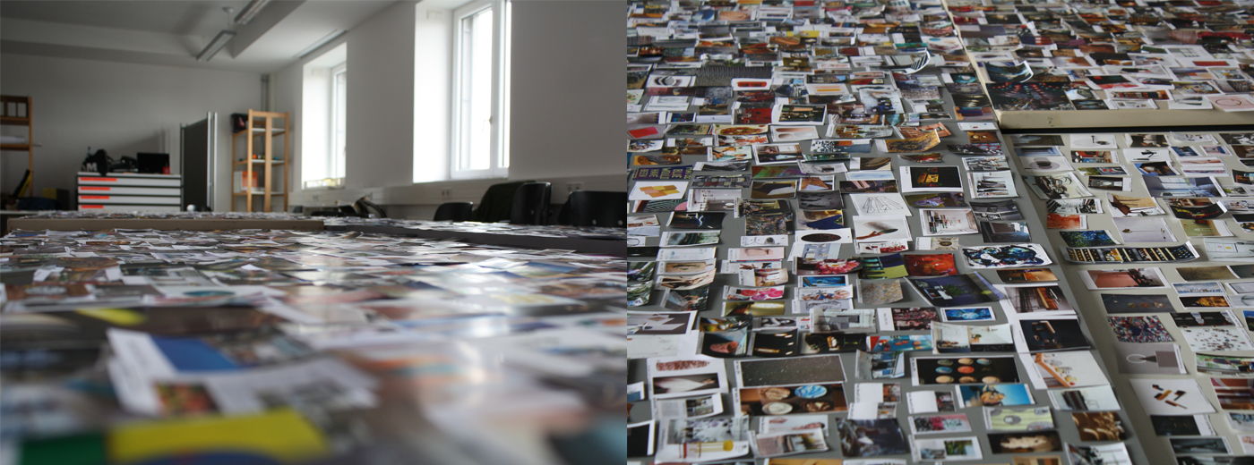
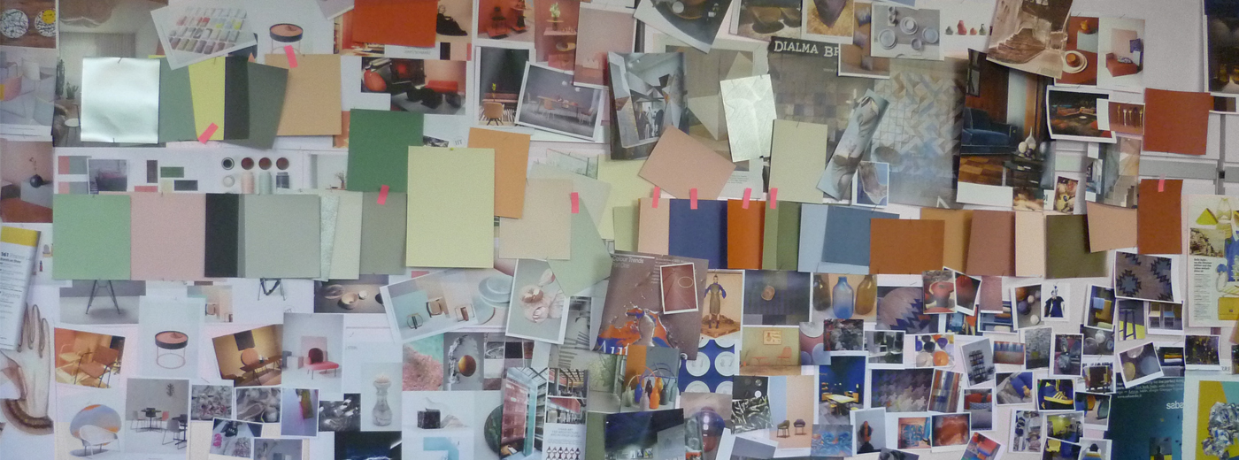
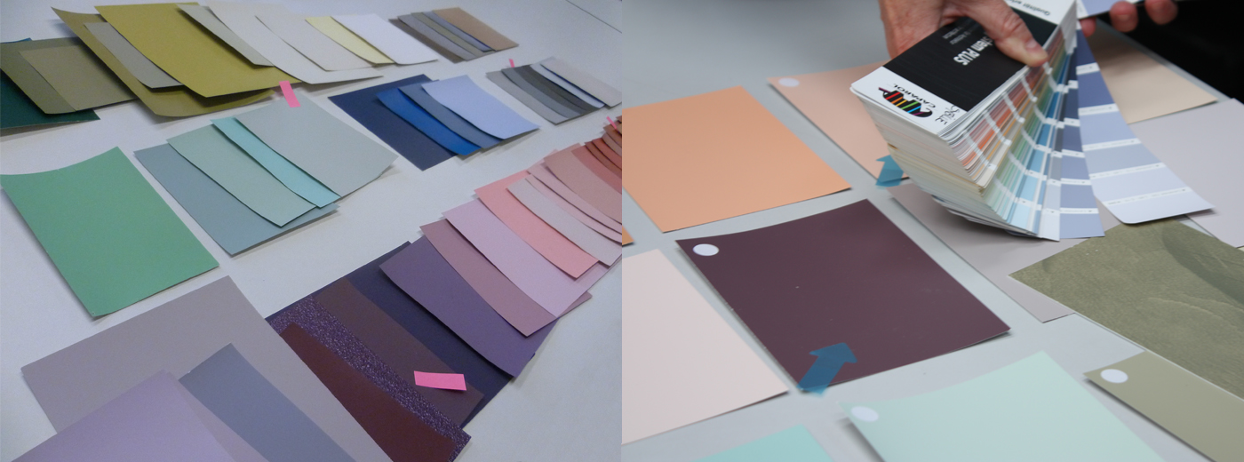
Taking in and translating. What sounds so innocuous is one of the most important stages in our trend scouting process. Which trend colours make it to the wall? We accept the candidates and test them in the Caparol ColorDesignStudio for their suitability for the wall. The effect of colours in interiors, on surfaces of different sizes or under certain lighting conditions is examined. And, not least, whether the colour tone is "likeable". Likeable? Of course! This is a central criterion. Because we live together with our wall colour, so it is a significant life companion!
Translating: Transformation to a Wall Colour
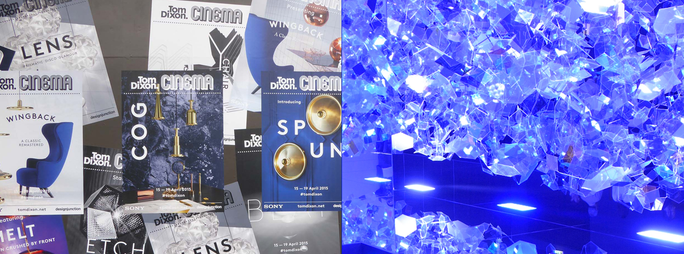
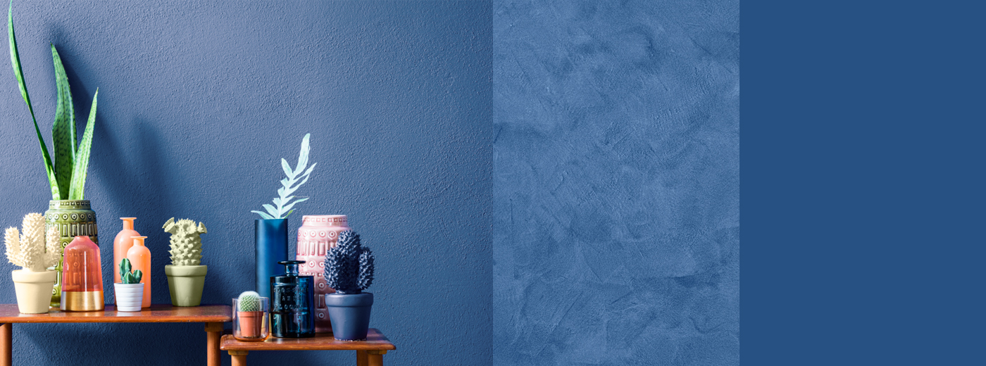
Heavy, dark or intense colours are only used for wall designs in exceptional cases. However, if these are trendy, they can be interpreted in a certain direction. Like our blue: We have modified the intensely luminous, vibrating ultramarine. It has become a bit cooler and calmer - therefore it is not obtrusive. But its special character has been maintained: powerful and captivatingly beautiful. Our Room Story illustrates the successful design.
Another way of translating dark colours for the wall is to choose a decorative surface. Example: Capadecor® Stucco Satinato in 3D Saphir 95. The dark of the blue colour becomes slightly velvety, deeper and softer - thus pleasantly homely, thus suitable for the wall.
Lemon Yellow: Sour with a Homely Touch!
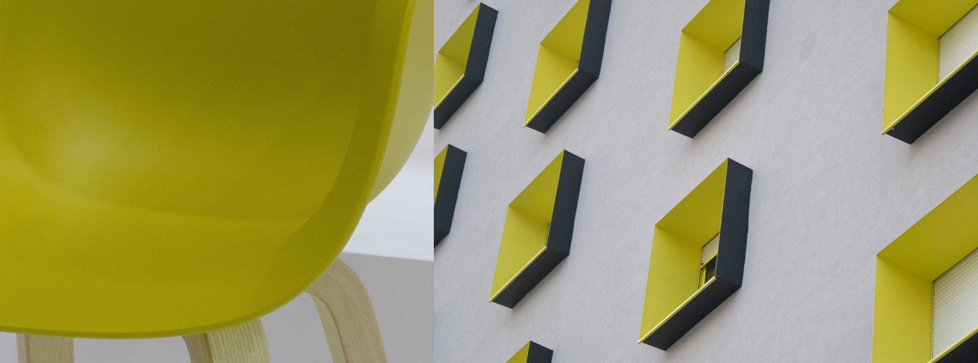
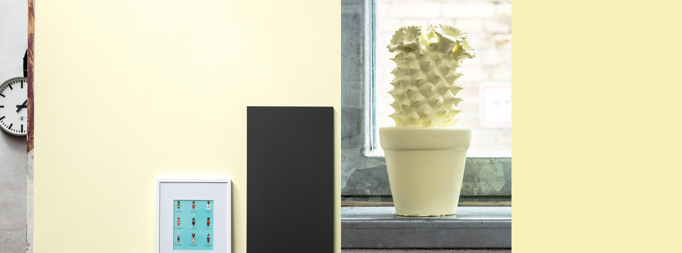
The trendy lemon-intensive yellow is not to be missed in the current trends either. But is this colour pleasant and likeable in the living environment? Do you want to live with it? We are exploring the nuances in which it can convey a pleasant room atmosphere. At the end we have turned it into a soft, light yellow hue with only a hint of lemon. This brings a bright, light atmosphere into the room and attracts a lot of sympathy.
Dark Khaki: Also an Appealing Feature on the Wall?
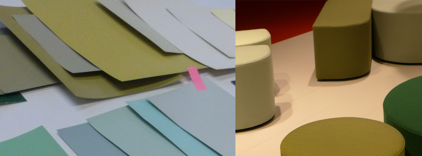
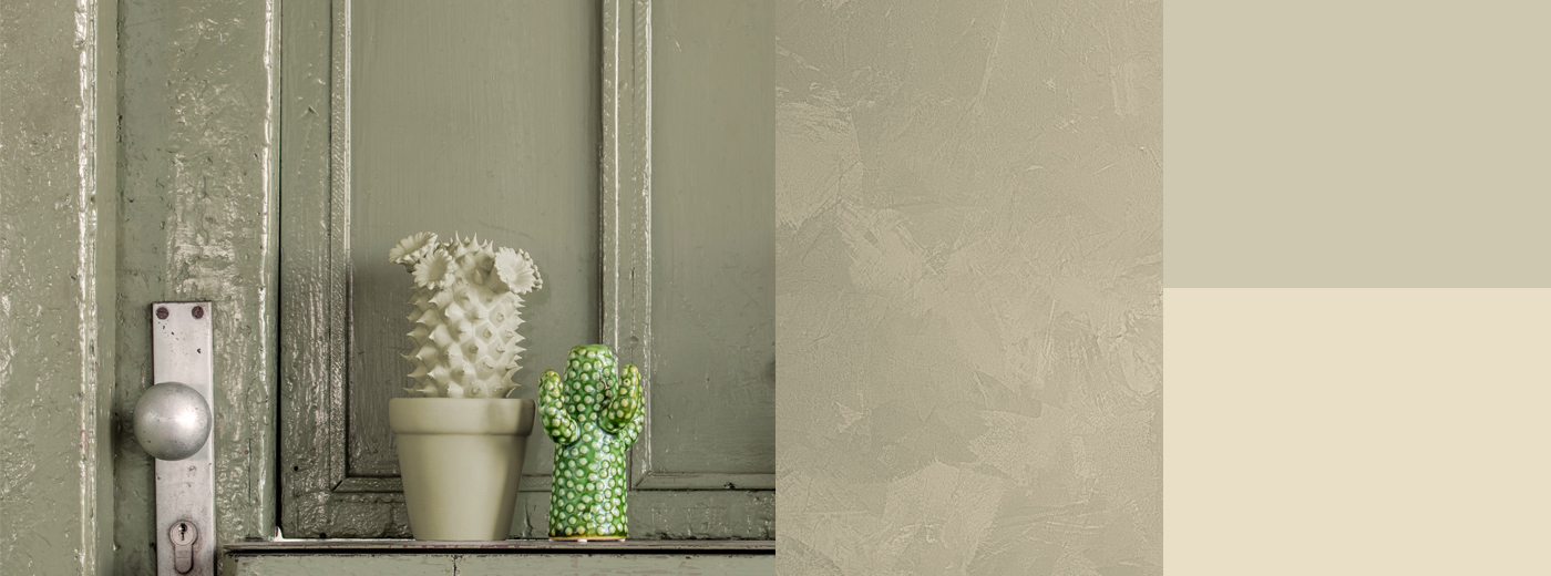
We take up the dark, grey khaki, which has an exciting effect in fashion with radiant or warm shades, translate it for the wall, but in two shades: a very light, creamy and a somewhat stronger, soft wall colour. These can be used to create attractive combinations and create a pleasant atmosphere.
The New Terracotta: It works!
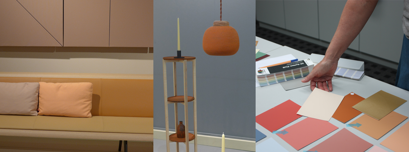
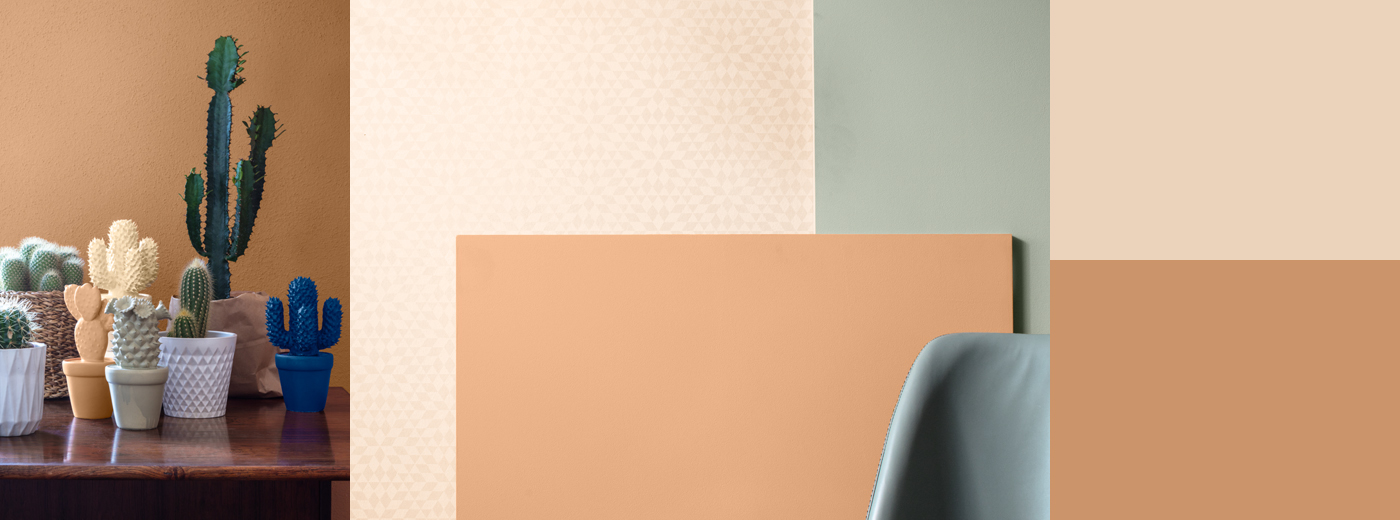
There are actually trend colours, which are made for the wall in terms of their mood and essence. The new terracotta is such a colour nuance. Warm and homely, but no longer Mediterranean-red. It is more modern and lighter and impresses with a noble naturalness. This colour already sets the right tone; perfect - nothing will be changed here!
Do you want to discover all trend colours? Simply click here!


